Flexible Content Items
In our first article about Flexible Content Items, we discussed a general overview of what Flexible Content Items are, how to use them and where to find them.
In this article, we will talk exclusively about the WYSIWYG (What You See Is What You Get) editor that you can add to just about any content type by choosing the "Add WYSIWYG" option under the Flexible Content area in the edit screen.
This article covers basic operations within the WYSIWYG.
WYSIWYG
A typical WYSIWYG (What You See Is What You Get) editor that gives you the ability to
- Embed images
- Embed videos
- Embed tables
- Blockquotes
- Make links
- Make primary buttons and secondary buttons out of links
- Link to content on the site by title instead of URL.
- You can also upload files there (there will be a pop-up window that has Help Text near the Upload File button that says”Use the button above to upload a document in a new tab. Once you add the document, close that tab and return to this screen and search for your document in the URL field.”)
- And all the other things a typical WYSIWYG can do
WYSIWYG toolbar
Read about basic text editor options.
This section discusses basic formatting and the WYSIWYG toolbar buttons.
Hover over a button to see a description of the button, or review the options below.
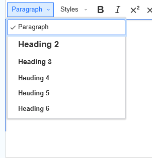
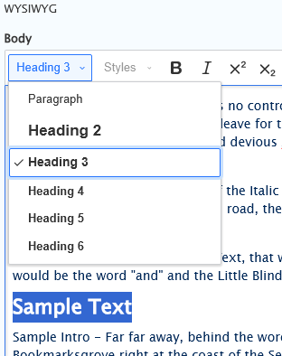
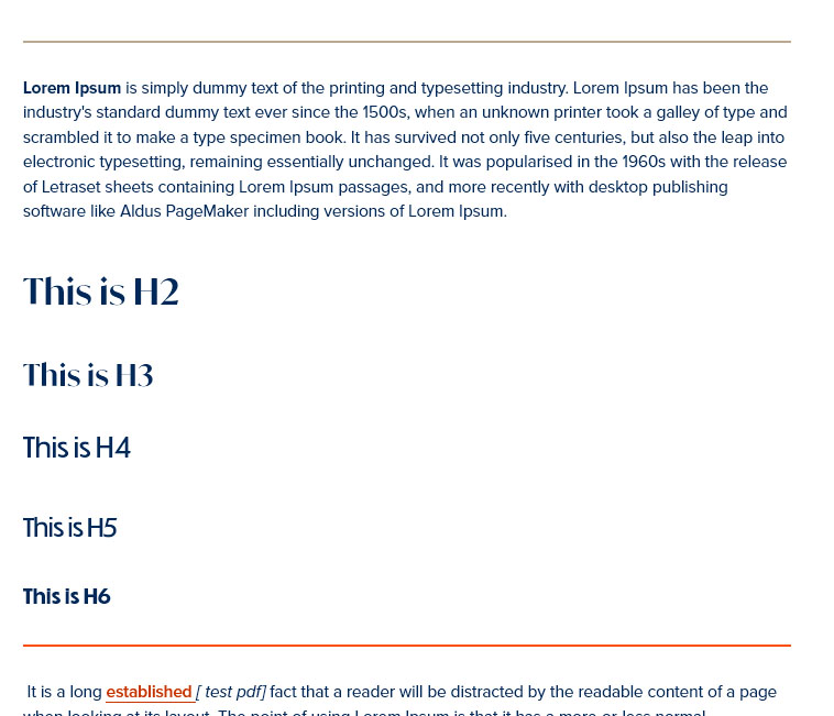
Paragraphs and Headings
Click the down arrow on the "Paragraph" button to see the list of available options to change the text between regular (paragraph) text and heading styles (heading level one - heading level 6). Paragraph formatting options allow you to set normal text or headings.
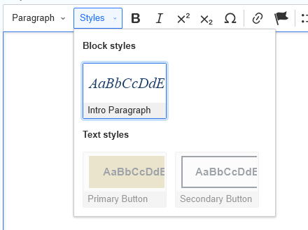
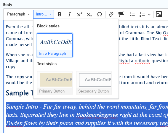
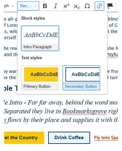
Styles - Links and Intro
Click the down arrow on the "Styles" button to see the list of available options to change the text between Intro Paragraph, and Primary or Secondary button styles.
Any text can be made into an Intro Paragraph, however only links can be made into either Primary or Secondary buttons.
Please note that other font and style options are set by the College template and cannot be changed here.
Sample Inro Paragraph
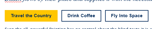
Sample Primary and Secondary CTA buttons
To change a link into a CTA button, simply either highlight all the text of the link or place your cursor in the middle of the link text and then select the button style you desire.
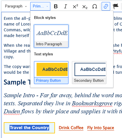
Here are how the CTA buttons look in the editor. These three buttons in a line were made by simply placing a few spaces between the link text for each button before creating the buttons.
Toolbar buttons
In the WYSIWYG you will most likely encounter all these buttons. Other editors, for an intro field or for one of the flex items, may have less of the buttons contained in the standard WYSIWYG toolbar. We will go over all of the buttons here.
Sample of Standard WYSIWYG toolbar:

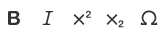
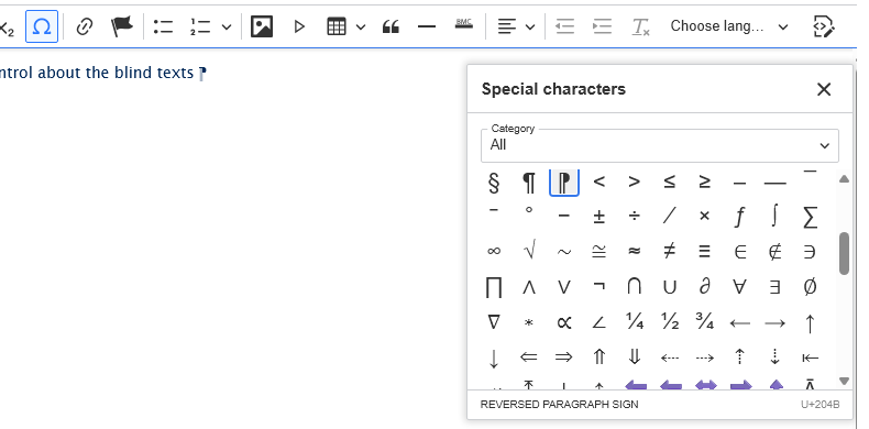
Left to right: Bold, Italic, Superscript, Subscript, Special Character.
The Special Character allows you to put various special characters, like a Reversed Paragraph sign:
Left to right: Link, Anchor Link

Left to right: Insert/Remove Bulleted List, Insert/Remove Numbered List. NOTE: the down-arrow on the numbered list button allows you to change the Starts with number value.

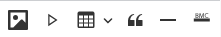
Left to right: Image, Video, Table, Blockquote, Insert Horizontal Line (default), Insert Branded Horizontal Line (special BMC branded line).
Note: Tables should be used only for tabular data, not for layout purposes. See the Accessibility Guide for details.
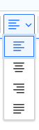
Top to Bottom: Align left (default selection), Center, Align Right, Justify
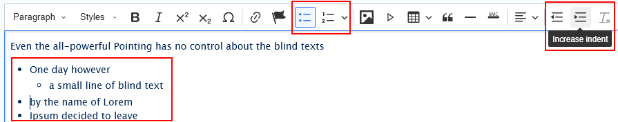
Left to right: Decrease Indent, Increase Indent
When working with lists (bulleted or numbered/lettered) you can increase or decrease the indent of the item to make it a nested list
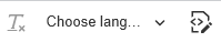
Left to right: Remove Format, Set Language, Source
Removing Format
The button is greyed out if there is no text to remove format from. If, however you paste something in that has extra formatting, the button will become active and you can select your text and press the button. You can then press the Format button to affirm extra formatting (like extra spans from Word) were removed.
The box around the button and it's neighbor shows the difference between a greyed out button and an active one. in the image above, you can see the Remove Format button is greyed out
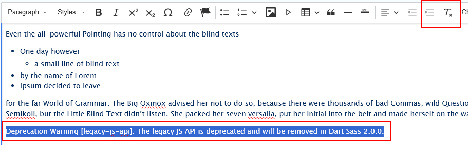
Source Button
This button allows you to see the HTML markup that will be on the page when you save the page. Drupal will strip out any tag it doesn't allow. Using the Source button will allow you to see if you need to remove extra formatting, like:
<span> NOTE: You can only use the Remove Format button while in the regular WYSIWYG. If you are in the Source Mode, all the toolbar buttons are greyed out and therefore inactive.
WYSIWYG Links
Learn about inserting links.
This section discusses adding links, adding link styles like buttons as well as linking emails and removing links.
Adding a link:
Linking to documents
The link above takes you to our article about linking to documents.
Since documents must be checked for accessibility and possibly sent for remediation, it is important to work with the Office of Communications and Marketing (OCM) to ensure whatever PDF you wish to add to the website meet accessibility standards.
Check in with your department to see if the content in the PDF really needs to be a PDF. If so, send it to OCM. If not, please type the content into a webpage, since webpages are automatically accessible.
Linking to an email address:
Simply type the email address in the WYSIWYG. Drupal will convert the email address to a link when you type a space after the email address. If you type punctuation after the email address, then Drupal will convert it to a link upon saving the page.
Linking to an external URL:
Linked Plain URL
Simply type the URL in the WYSIWYG. Drupal will convert the URL to a link when you type a space after the URL. If you type punctuation after the URL, then Drupal will convert it to a link upon saving the page.
Alternatively, if you copy a URL from a browser and paste directly into the editor and hit enter, the URL will become a link.

Linked Text
If you need your text to be linked to a URL outside of our website, you can also use the Link Icon to achieve this.
Simply type your text and highlight it. Then click the Link icon. Once the Link Dialog opens, type in full external URL into the link field (including http:// or https://)

Once you’ve typed in the external URL, click the green Insert button to accept your typed URL
Once you’ve checked that the external URL is correct, click the green Insert button again to save the linked text.
Once you do this, you will see a different Link Dialog with options to edit or unlink.

If you are using an external link, like https://google.com, you will want to have the link open in a new window.
To do this, if you no longer see a Link Dialog put your cursor into the link to expose the Link Dialog.
Once you see the Link Dialog, you can see that you can Edit the link (pencil icon), edi the Link Properties (the toggle icon) or simply Unlink (link-with-x icon).

To edit the Link Property settings, click the toggle icon which will expand the "Link Properties" Dialog and slide the Open in new window so it is green
 side by side screenshots with Link Properties option expanded.
 Left side shows default Open in new window Off, Right side shows Open in new window On
Once you’ve typed in the full external URL and added the optional Open a new window the Link Dialog should close.
Linking to an internal URL:
If you press the Link button with just your cursor in the editor and start typing a /node/# URL the Link Dialog will open.

If you never type anything in the Displayed Text field and just click the green Insert button, you will just see the URL as the text.

In order to link a word or phrase, you must first highlight the text, then press the Link button. A Link Dialog will pop up near the text.

Searching for content by title. For internal www.brynmawr.edu links, the title search is the recommended and best approach

When you select the title you want

Drupal will put in the Drupal-specific relative URL so Drupal can find it for the user later when they click on the link:

Once you’ve made your selection, click the green Insert button (save) in the Link Dialog to save the linked text.

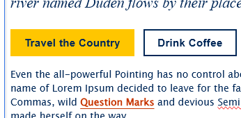
Links as Buttons
Now you can highlight the text link and get to apply one of two styles to it, Primary Button or Secondary Button. You could also just let it be link text, if it is just part of a paragraph. See Link Styles above for details on how to make these Primary and Secondary CTA buttons in the WYSIWYG..
The nice part is that you can see the style for plain link text, Primary button or Secondary button in the WYSIWYG:
Linking to a specific part of a page:
These links are called “anchor links.” It is like golf, where the link is where you click from (like the ball on the tee) and the anchor name is where you land (like the flag where the ball should land).
Two cases for Anchor Links:
- Keeping people on the same page, but linking to things either above or below where they are on the page.
- Sending people to the related topic on a different page. By putting the Anchor Link as part of the URL, people will be taken directly to that specific place on a different page.
Making an anchor link involves two steps:
Make the Anchor Name:
Anchor Names become part of the URL.
It is for this reason that we need to have our Anchor Name NOT CONTAIN any spaces or special characters. Example: https://www.brynmawr.edu/inside-119#akFancyAnchorSpot
Using camelCase to write our Anchor Names is recommended.
First, select where in the text you want your Anchor Name to be placed. Remember, this is the Flag the actual link is aiming to land on.
I suggest placing your cursor at the very beginning of a paragraph or Heading text.
Next, click the flag icon in the tool bar.

This will open an Anchor Name Dialog right where you placed your cursor.
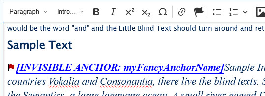
Choose a name for your anchor (example: “myFancyAnchor”).
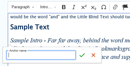
Once you type your anchorName, click the Green Check (save) in the Anchor Name Dialog to save the Anchor Name.
Drupal makes it very obvious that not only that it is an Anchor Name, but that it is Invisible, meaning once you save the page, you won't see it.
Make the Anchor Link:
Once your Anchor Name is set, you can make a link to it.
For Linking on the same page
The address of your anchor will then be “#AnchorName”. For example, “#myFancyAnchor”.
Drupal may tell you that it couldn’t find any suggestions for that text so it will use it as is, which is exactly what we want.

For Linking on a Different page
The address of your anchor will then be the URL of the page with “#myFancyAnchor” added to the end.
First, set your anchor on the Other Page following instructions above. In our example, we will be linking to our Basic Page with All Content. This page has an Anchor Name on it (akTestAnchor)
Then, on the page you want to link from (or hit the ball from), make a link. In this example, it is our example page.
1 - highlight some text and start typing in the title of the page.

2 - Then, once I click on the correct selection, I will add the # and the Anchor Name, so the URL in my Link Dialog will look like this (/node/53216#akTestAnchor). Then I can press the green Insert button.

3 - Since we don't want people to get lost from our original page, we are going to expand the Link Properties (just like in the external Google link example above) and click the Open in new window toggle.

4 - Once we are satisfied with all our settings, we can click elsewhere in the WYSIWYG and the Link Properties will be saved.
In either case, please always make sure to test your anchor link and ensure it lands on the correct page and place on the page (anchor name)
Remove links
Remove links by clicking your cursor in the link text, a Link Dialog will appear. To remove the link from the text, click the chain link with x icon.

Edit Links
Edit links by clicking your cursor in the link text, a Link Dialog will appear. To edit the link, click the pencil icon. This will expand the Link Dialog. From there you can select a new page title or write a full external URL.

Set Link Properties
Link Properties to set are for having link open in a new tab on your browser.
Edit the Link Properties by clicking your cursor in the link text, a Link Dialog will appear.
To edit the Link Property settings, click the toggle icon which will expand the "Link Properties" Dialog and slide the Open in new window so it is green
side by side screenshots with Link Properties option expanded. Left side shows default Open in new window Off, Right side shows Open in new window On
WYSIWYG Images, Videos and Audio
Learn to add images, videos and audio in the WYSIWYG
This section discusses adding image and videos within the WYSIWYG editor.
The other things that are improved or different are how you can embed an image or video, and also how a blockquote looks on the actual page. To see how to upload new Videos and how to upload new Images, please read our Media article.
Add an image
To add an image, simply place your cursor where you want the image to appear and then click the image icon in the toolbar. This will give you a pop-up to select a new image for upload or select one that is already in the Media Library. In this example we are using one that is already in the Media Library.
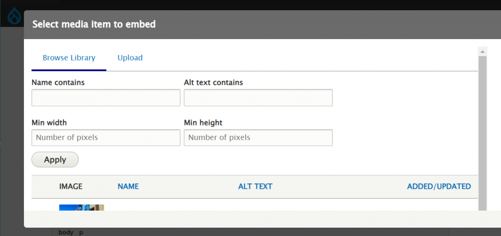
You will be able to select the style the image receives as it is appearing in the WYSIWYG area of the page. You can have it float right or left or take up the width of the WYSIWYG area.
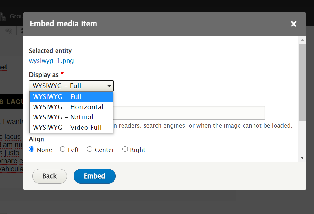
You can scroll down in this popup window to create a caption or just have the image appear on its own.
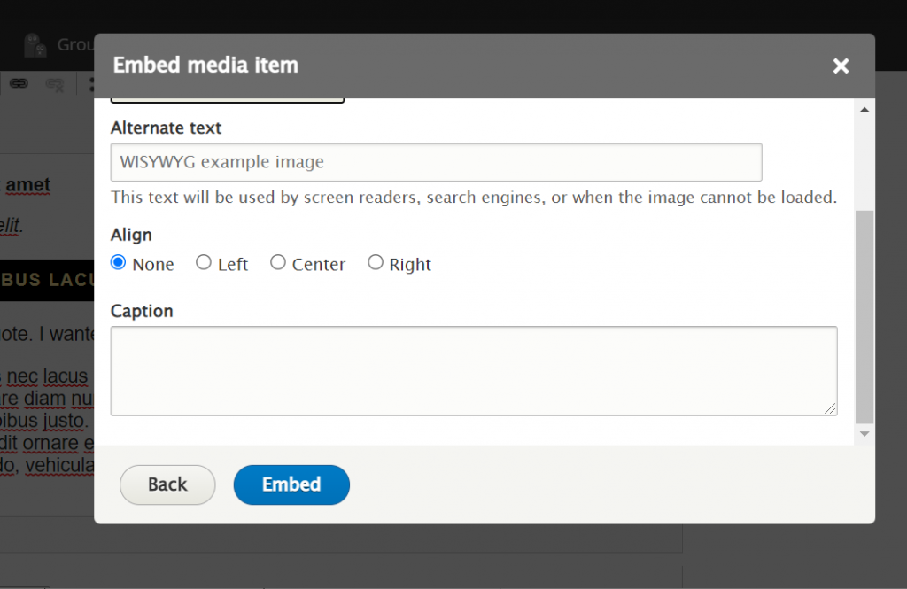
When you are satisfied with all the selections you have made in the popup window to embed the media item, you can press the Embed button
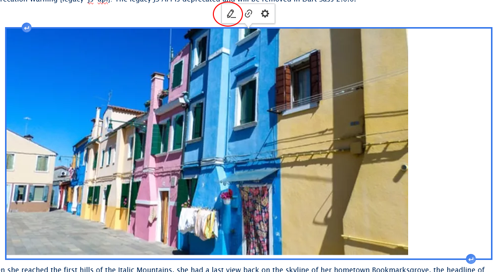
If you realized you needed to edit the image, you can click on it within the WYSIWYG and select Edit Image. Double clicking on the media object also brings up the edit screen. This will bring you back to the Embed Media Item popup window so you can amend your selections.
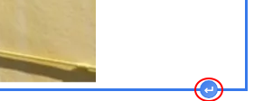
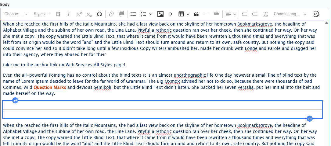
If you need to add a paragraph below an image, just click on the bottom arrow-return-in-the-blue-circle.
Embed a Video (YouTube or Vimeo)
This feature is limited to only YouTube or Vimeo videos.
If you wish to embed a Panopto video, please see our Embed Other Content Items instructions.
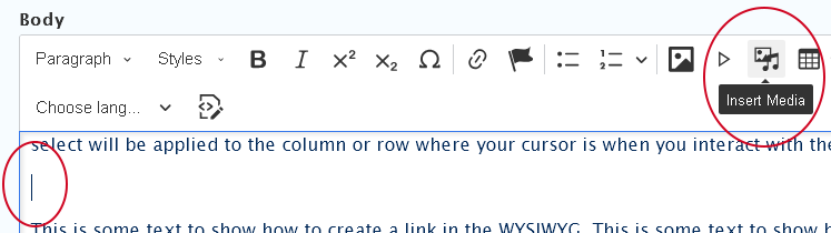
To embed a video in the WYSIWYG via the Insert Media button, you would place your cursor where you want the video to appear and then click the Insert Media icon in the toolbar.
- Place cursor on a new line where you want your video to appear
- Press the Insert Media button in the toolbar
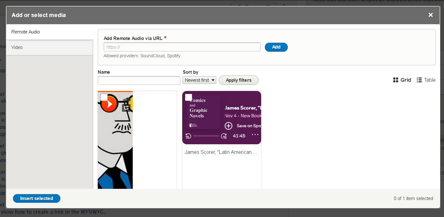
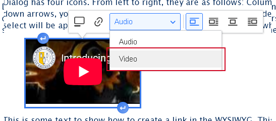
- The Media Library modal window will open. The default is that the Remote Audio tab is selected upon opening the modal window.
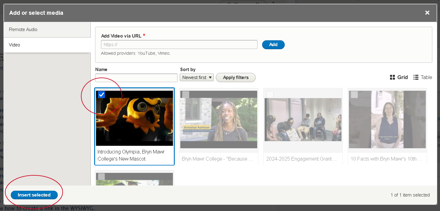
- First select the Vertical Tab on the left for the type of media you are inserting. In this case it will be the "Video" tab
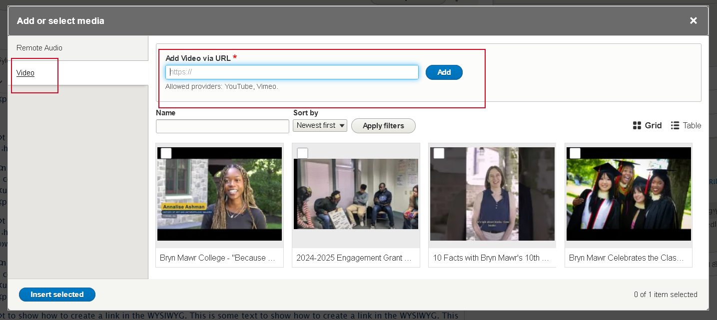
- You can now choose to Use an existing video or Add a new one to the library
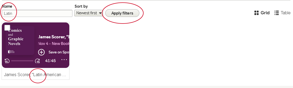
- Find an Existing Video in the library
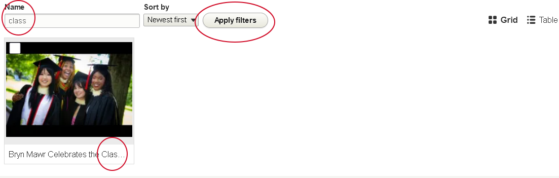
- Using the Name filter, type a word you think the Name contains and press "Apply filters". This example will yield all the videos whose name contains "class", for instance. To clear the Name filter, simply delete the phrase you entered and then press "Apply filters" again.
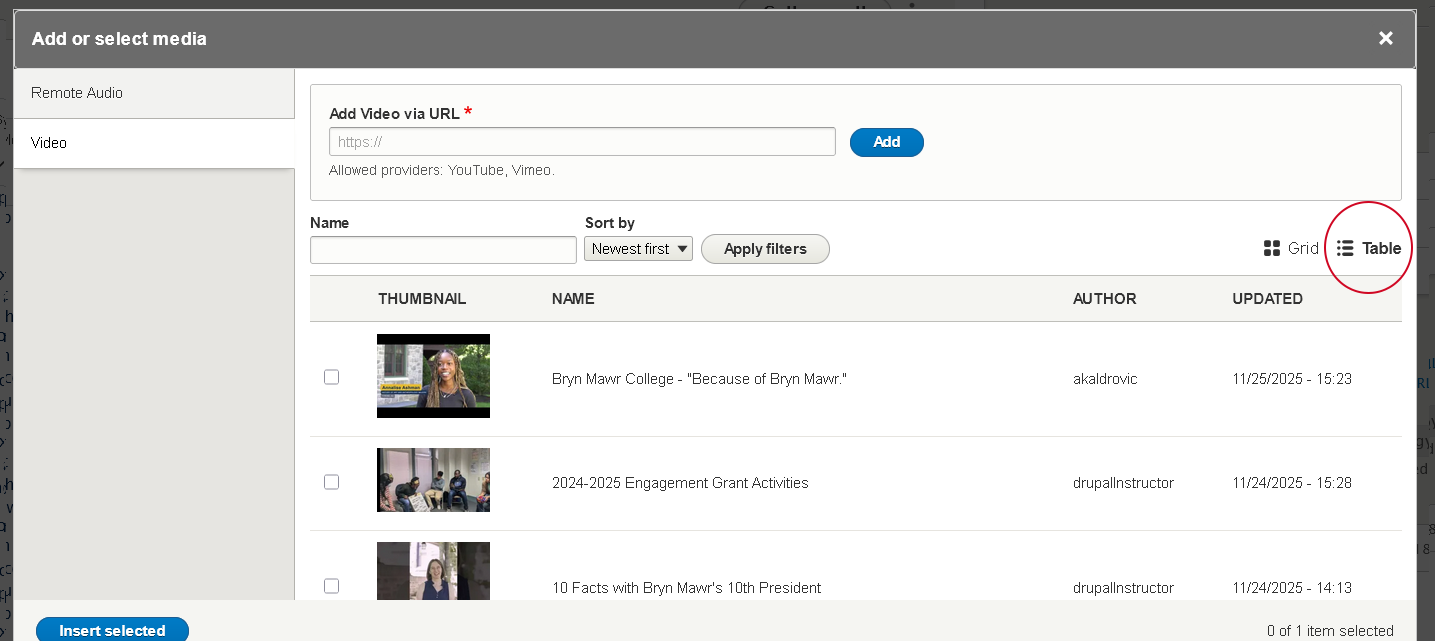
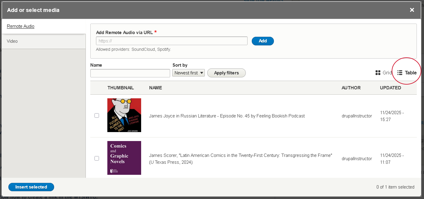
- You can also use the "Table" view by clicking the icon to the right of the filters, incase the Grid view isn't as helpful
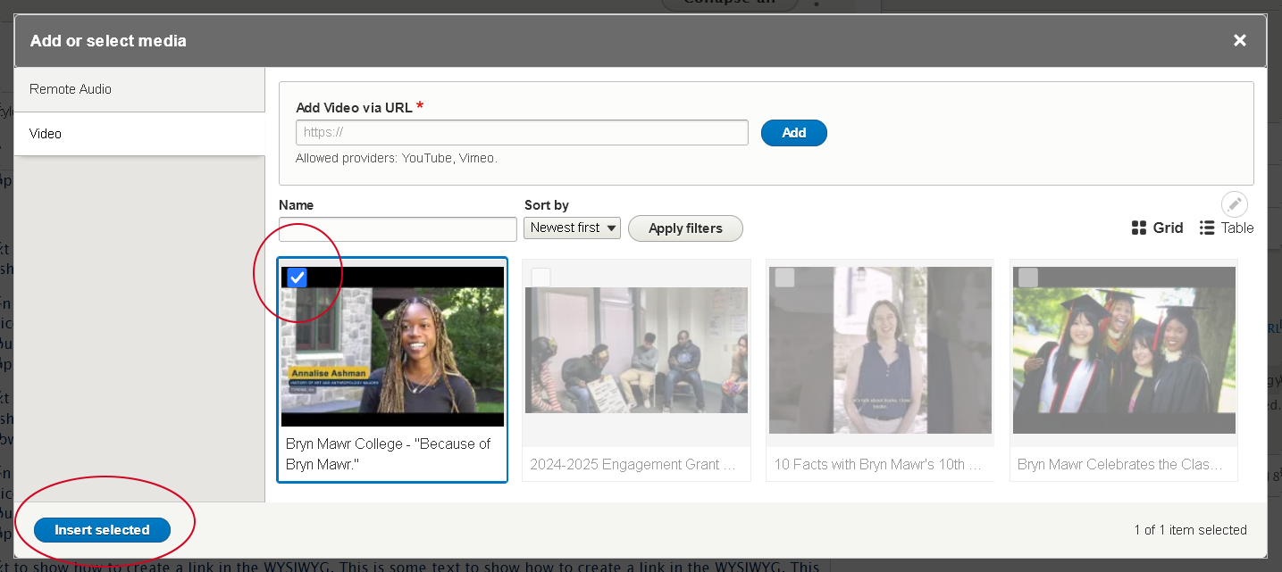
- depending on the view (Grid or Table), click on the video or check the box next to the video you wish to insert
- press the "Insert selected" button at the bottom of the modal window
- Using the Name filter, type a word you think the Name contains and press "Apply filters". This example will yield all the videos whose name contains "class", for instance. To clear the Name filter, simply delete the phrase you entered and then press "Apply filters" again.
- Add a New Video to the library
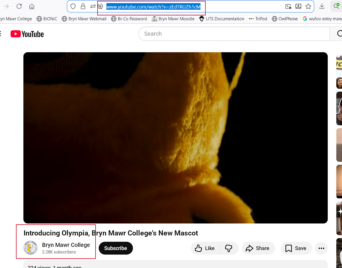
- visit your video on the web. for example, we are going to the Bryn Mawr College YouTube channel and selecting a video to view.
- once there, you can simply copy the URL from the browser address bar
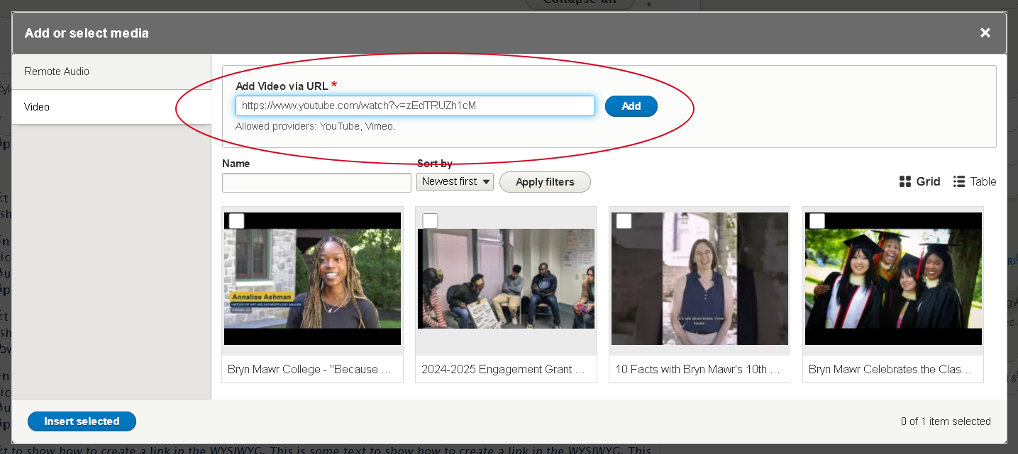
- then, simply paste that URL into the "Add Video via URL" field and click the blue "Add" button
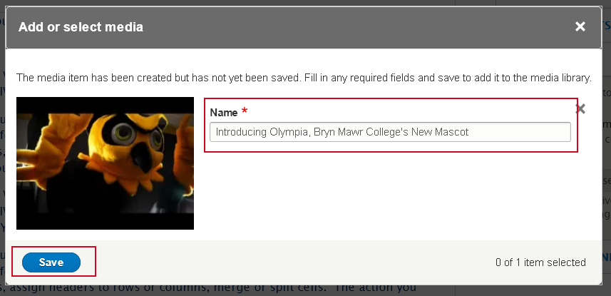
- this will take you to a different modal window that lets you edit the Name field of the Video. This field is how you will find the video later in the library.
- once you are satisfied you can click the "Save" button
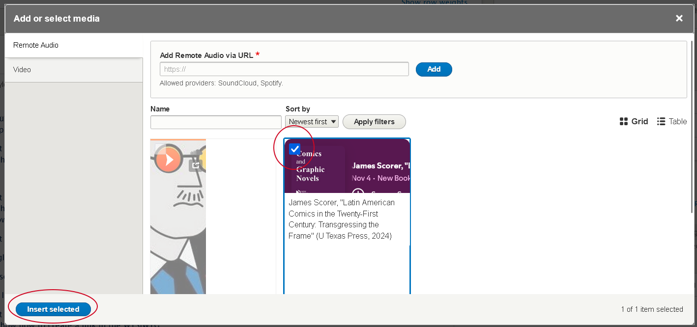
- this takes you back to the library modal, where you can see that the video has a check mark on it. This means it is already selected.
- If you are happy that is the video you wish to select, press the "Insert selected" button
- Find an Existing Video in the library
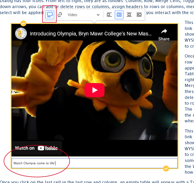
- Once you are back in the editor, you will see that the video seems small.
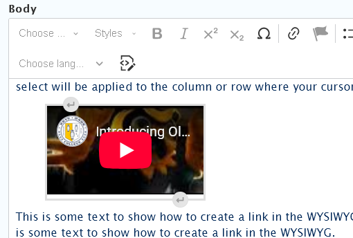
you can click once on the video to make the Video Dialog appear to adjust how it should appear.- select the "Video" view mode. This will ensure it displays properly on the page
- you can also choose to float the video to the right or the left, which will then have the text on the page wrap around it.
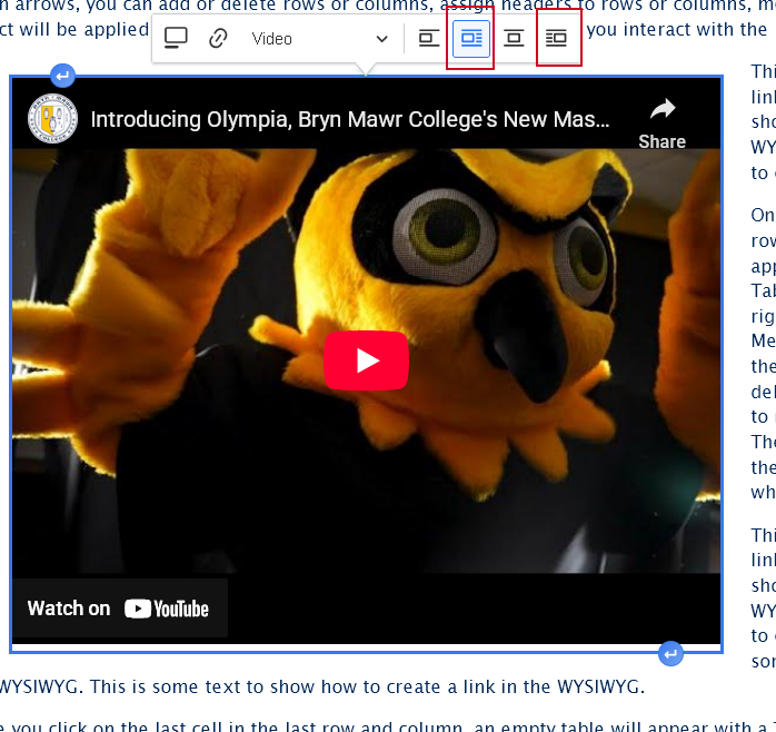
- you can also choose to add a caption to the video
- select the "Video" view mode. This will ensure it displays properly on the page
- Similarly to an Image, you can use the "Insert Paragraph" before and after buttons that you see if you hover on the video in order to add content before or after the video


Embed an Audio (Spotify or SoundCloud)
This feature is limited to only Spotify or SoundCloud audio tracks.
What if my audio track, podcast or playlist can't also be found in Spotify or SoundCloud? please see our Embed Other Content Items instructions.
To embed an audio in the WYSIWYG via the Insert Media button, you would place your cursor where you want the audio to appear and then click the Insert Media icon in the toolbar.
- Place cursor on a new line where you want your audio to appear
- Press the Insert Media button in the toolbar
- The Media Library modal window will open.

- First select the Vertical Tab on the left for the type of media you are inserting. In this case it will be the "Audio" tab

- You can now choose to Use an existing audio or Add a new one to the library
- Find an Existing Audio in the library
- Using the Name filter, type what you think it is called and press "Apply filters"
- You can also use the "Table" view by clicking the icon to the right of the filters, incase the Grid view isn't as helpful
- depending on the view (Grid or Table), click on the audio or check the box next to the audio you wish to insert
- press the "Insert selected" button at the bottom of the modal window
- Using the Name filter, type what you think it is called and press "Apply filters"
- Add a New Audio to the library
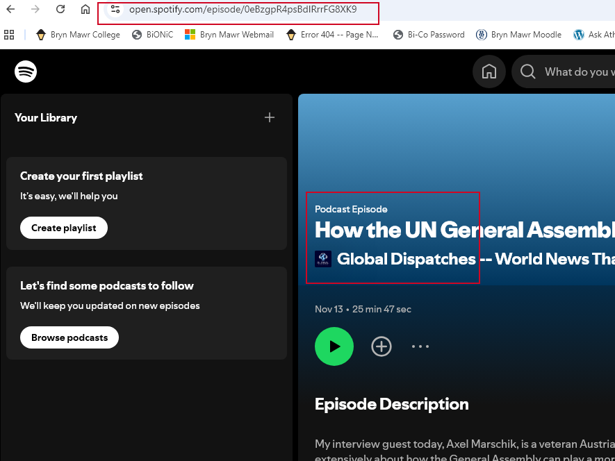
- visit your video on the web. for example, we are going to the Global Dispatches podcast on Spotify and selecting a track to use.
- once there, you can simply copy the URL from the browser address bar
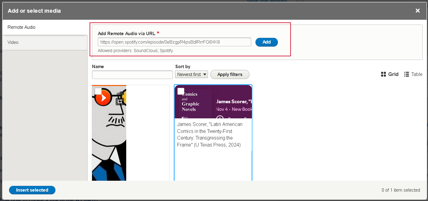
- then, simply paste that URL into the "Add Remote Audio via URL" field and click the blue "Add" button
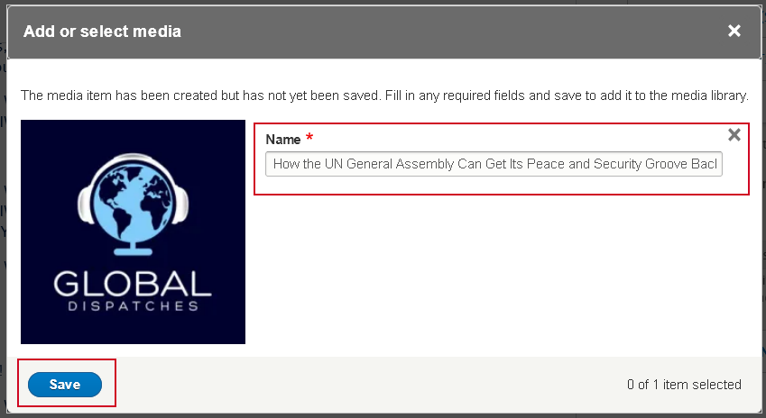
- this will take you to a different modal window that lets you edit the Name field of the Audio. This field is how you will find the audio later in the library.
- once you are satisfied you can click the "Save" button
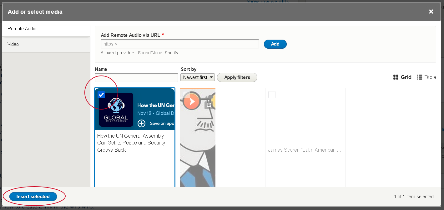
- this takes you back to the library modal, where you can see that the audio has a check mark on it. This means it is already selected.
- If you are happy that is the audio you wish to select, press the "Insert selected" button
- Find an Existing Audio in the library
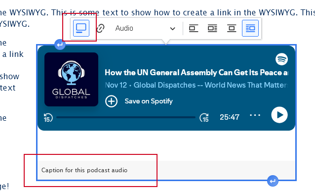
- Once you are back in the editor, you can click once on the audio to make the Audio Dialog appear.
- Check to see that the "Audio" view mode is default selected. This will ensure it displays properly on the page
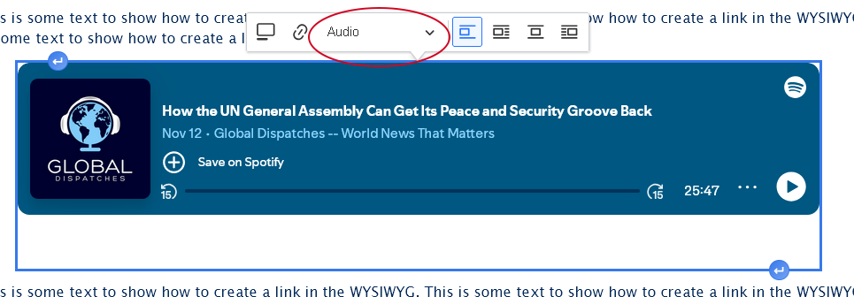
- You can also choose to float the audio to the right or the left, which will then have the text on the page wrap around it.
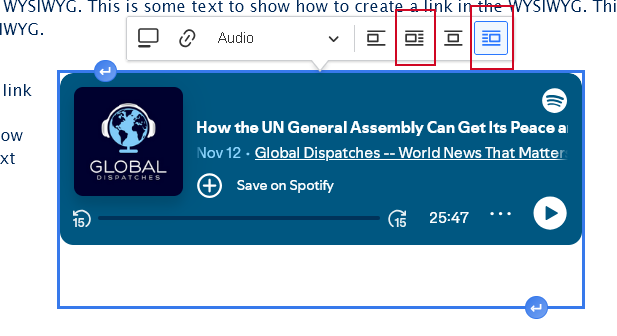
- You can also choose to add a caption to the audio
- Check to see that the "Audio" view mode is default selected. This will ensure it displays properly on the page
- Similarly to an Image, you can use the "Insert Paragraph" before and after buttons that you see if you hover on the audio in order to add content before or after the audio.


WYSIWYG Blockquote
Learn how to add a blockquote.
Please note that blockquotes display in a very different way than you might expect. Read on to learn what it looks like on the page
This Section discusses how to add a blockquote within the WYSIWYG and how it displays
To add a blockquote, simply type your text then highlight it and select the quote-marks in the toolbar. Once you click the quote icon in the toolbar, the blockquote will be styled in a grey box to the right.
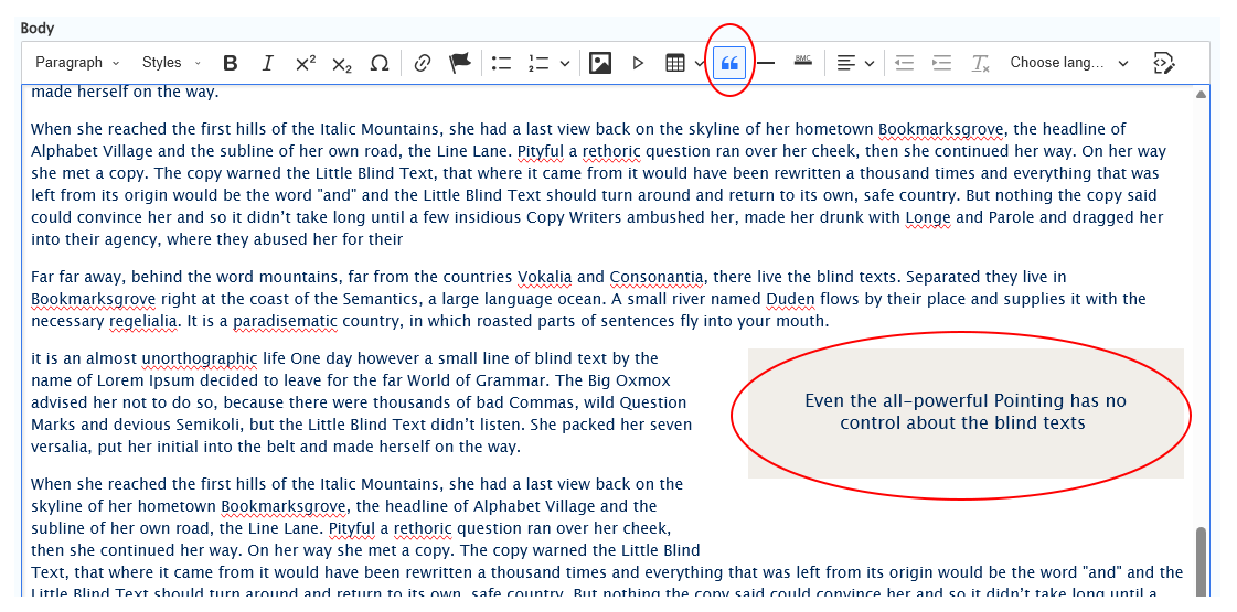
As you can see, when I save my page and look at it, the blockquote appears as it did in the editor, in a grey box on the right side:
To Remove a blockquote, simply click into the blockquote text, then click the toolbar button and it will un-blockquote the text.
WYSIWYG Tables
Learn how to create, edit, and delete tables
This section discusses how to add, edit, delete tables and how insert-from-Word or insert-from-Excel.
You can also create a table in the WYSIWYG by putting your cursor where you want the table to be inserted and pressing the table icon in the WYSIWYG toolbar, then you can select how many columns and rows you want from the grid that appears:

Once you click on the last cell in the last row and column, an empty table will appear with a Table Dialog above it. The Table Dialog has four icons. From left to right, they are as follows: Column, Row, Merge Cells, Toggle Caption on/off. With these icons' down arrows, you can add or delete rows or columns, assign headers to rows or columns, merge or split cells. The action you select will be applied to the column or row where your cursor is when you interact with the icons.

Accessibility Tip: Tables should always have at least one header (row or column) so people with screen readers can understand the data you are presenting.
Since I wanted the first row to be a Header Row, I put my cursor in the first cell, interacted with the Row Icon dropdown and then toggled the Header row ON. Once That is set, I can simply click back inside my table cell to start typing.

As long as you are in the table, you have access to interact with the icons to amend the table as needed.

Pasting tables from Word or Excel
You can also just put your cursor where you want the table to show up and paste the table from Google Sheets, Word or Excel right there. As you can see, there are no headers. You would need to click into the table to amend the properties.
 table from google sheets
You can also copy some cells from a Word table or an Excel spreadsheet and paste it right into the WYSIWYG or you can insert a table, highlight all the cells and then paste. Here is how they look in the WYSIWYG.
When pasting a table or cells from a table from either Word or Excel, you have to clear formatting. Luckily, this table didn't need it, as evidenced by the greyed-out Clear Format button circled in the screenshot below.

Editing an existing table
To make edits to your table, just click into your table and interact with the icons, or edit the text directly.
If you need to edit the table to, say, add a header row, you can click the icons to see what things you can do. You can add cells, rows, columns. You can add header row or header column by interacting with the correct icon.

The rest of the things you can do is very similar to what you are used to with a typical WYSIWYG such as bold, italics, text alignment, and bullet points.
To Delete a table
Hover over the table and click on the upper left-hand box handle of the table

the border around the table will change from gold to blue, then press the backspace key.

Horizontal Rule or Horizontal Line
The <hr> element defines a thematic break in an HTML page (e.g. a shift of topic) and is most often displayed as a horizontal rule that is used to separate content (or define a change) in an HTML page.
We now have the ability to make our Horizontal Rule or Horizontal Line (they are interchangeable terms) in the WYSIWYG get the default or branded color of our website. In the instructions, we refer to them as either HR or Horizontal Rule.

We have two toolbar buttons, from left to right: Default Horizontal Line, Branded Horizontal Line
Follow these simple instructions to make your Horizontal Rule go from a thin black line to a thicker, more colorful one with more space before and after it to help define it better.
TO SELECT the HR for styling:
add a new Horizontal Rule (or HR) to your WYSIWYG content by putting your cursor at the end of the line of text, hitting the enter key and then pressing the Horizontal Rule button in the toolbar.
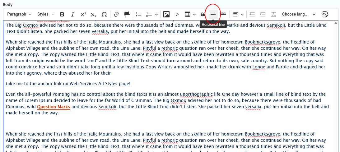 cursor placement in order to add the Horizontal Rule (HR) by pressing the toolbar button.
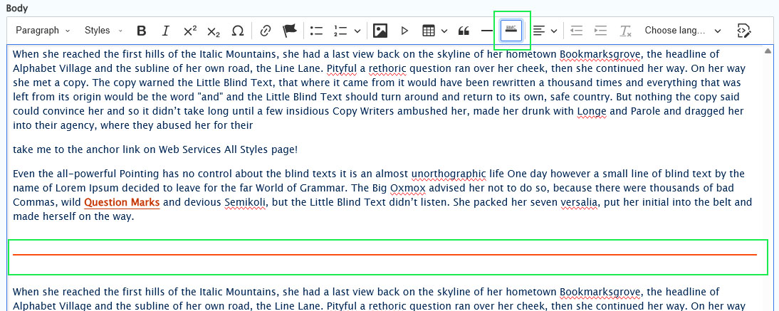
- Pressing the Default Horizontal Line button produces a thinner bronze color Horizontal Rule
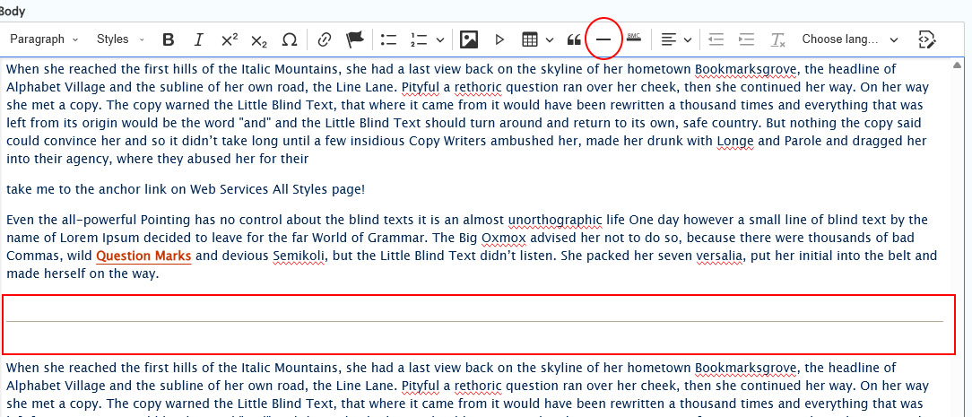
To change the HR from the Default to the branded, simply click into the HR so you see the blue box
Then select the BMC (branded) Horizontal Line button in the toolbar and it will change. See the neon-green boxes in screenshot below. The HR should turn the color blaze


Here is how both the plain and the Branded HR looks on the page:
 Plain and Branded Horizontal Rule (HR) element
More Flex Articles
Please see the following Articles for how to use the following Flexible Content Items.
- FLEX: Basic - WYSIWYG (basic, links, tables, blockquotes and images & videos from library)
- FLEX: Basic 2 - Accordion, Callout, Carousel, Contact, Embed, Social Media: Callout, Special List: Large, Special List: Small
- FLEX: Intermediate A - WYSIWYG (Video), Columns, Feature: Grid, Image Gallery, Image List
- FLEX: Intermediate B - People: List, Social Media: Connect, Feature: Large, Feature: Medium, Feature: Quote, Image Detail: Large
- FLEX: Advanced - Event 3-up, News 3-up, News & Contact, Story 1-up, Story 3-up, Announcement 4-up
- FLEX: Special - Slide: Homepage Hero, Homepage Feature: Large, Homepage Feature: Medium, Homepage Feature: Story, Course Code, Description Code, Donor List
Please note that Flex Advanced and Flex Special items require training and possibly special permission levels.
As with anything on the site, if you are unsure what the item is, how it looks or how to best utilize it, please see our sample pages Basic Page with all content and News article with all content or reach out to Communications for guidance at communications@brynmawr.edu.
Please note, there are corresponding training videos available that cover some of the items in these articles. Some items may require increased permission levels and special training. Please reach out to Communications for guidance at communications@brynmawr.edu.
If after reading this article or watching the training videos you still have questions, we can help! Sign-up for any of our Drupal Drop-ins throughout the year. Schedule a Drupal training session for you or your whole department with our Drupal Trainer. If you have any additional questions or problems, don't hesitate to reach out to the Help Desk! Phone: 610-526-7440 | Library and Help Desk hoursStill need Drupal help? Have more Drupal questions?
Questions?
Email: help@brynmawr.edu | Service catalog
Location: Canaday Library 1st floor
