Flexible Content Items
In our first article about Flexible Content Items, we discussed a general overview of what Flexible Content Items are, how to use them and where to find them.
In this article we discuss how to create the following Flexible Content Items:
- WYSIWYG (Video)
- Columns
- Image Gallery
- Image List
Embed a Video (YouTube or Vimeo)
This feature is limited to only YouTube or Vimeo videos.
If you wish to embed a Panopto video, please see our Embed Other Content Items instructions.
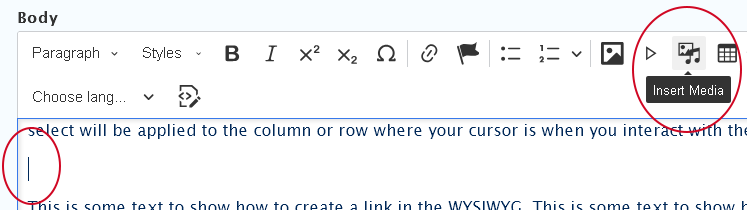
To embed a video in the WYSIWYG via the Insert Media button, you would place your cursor where you want the video to appear and then click the Insert Media icon in the toolbar.
- Place cursor on a new line where you want your video to appear
- Press the Insert Media button in the toolbar
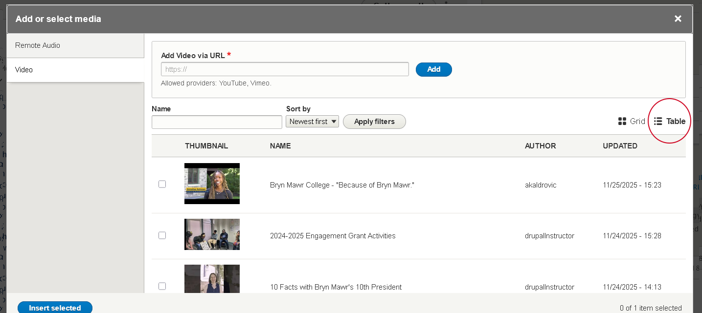
- The Media Library modal window will open. The default is that the Remote Audio tab is selected upon opening the modal window.
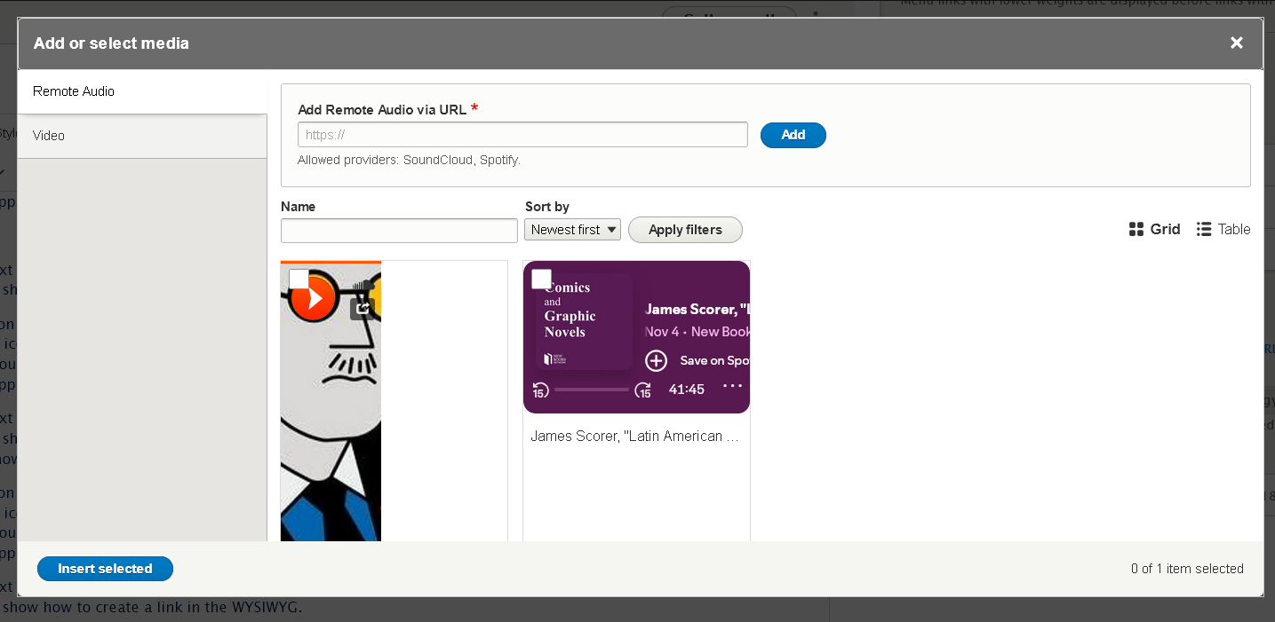
- First select the Vertical Tab on the left for the type of media you are inserting. In this case it will be the "Video" tab
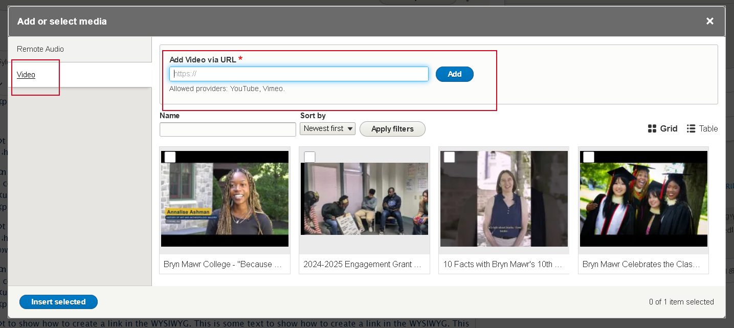
- You can now choose to Use an existing video or Add a new one to the library
- Find an Existing Video in the library
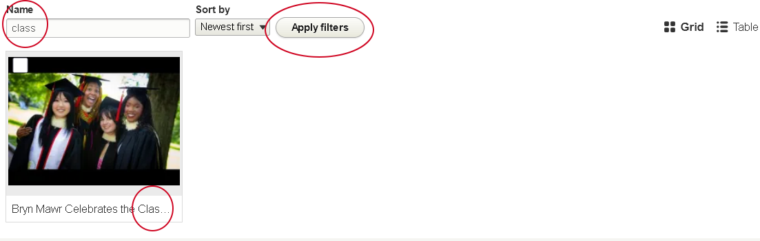
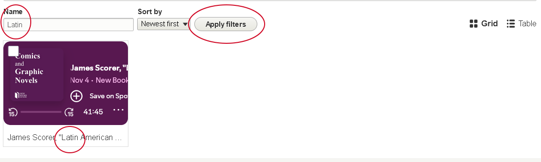
- Using the Name filter, type a word you think the Name contains and press "Apply filters". This example will yield all the videos whose name contains "class", for instance. To clear the Name filter, simply delete the phrase you entered and then press "Apply filters" again.
- You can also use the "Table" view by clicking the icon to the right of the filters, incase the Grid view isn't as helpful
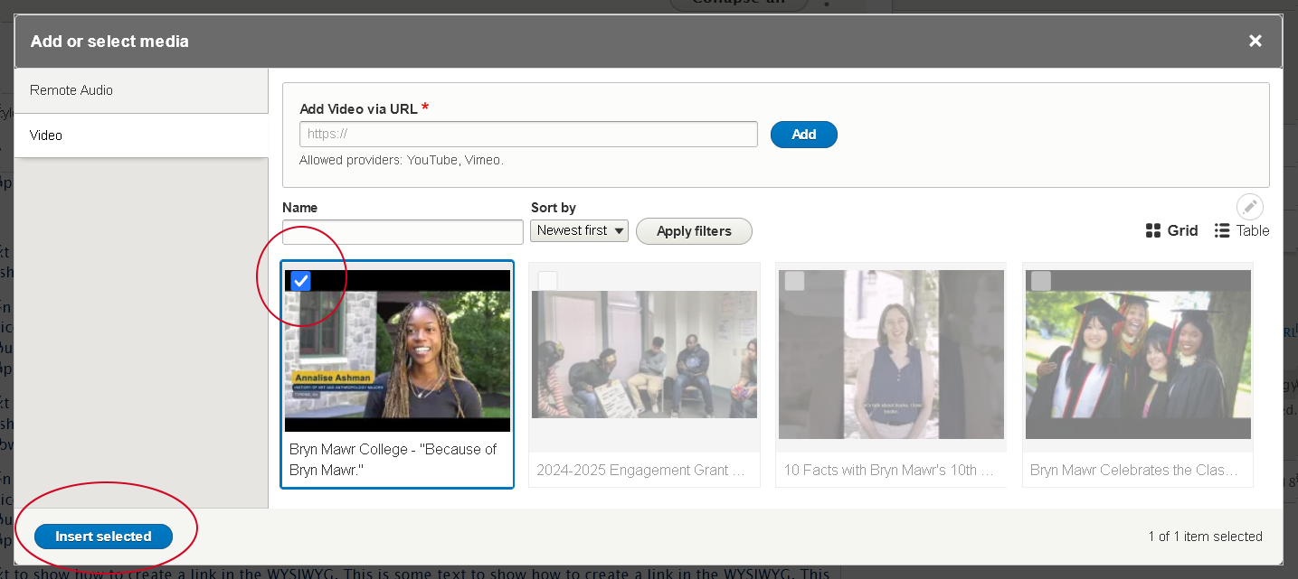
- depending on the view (Grid or Table), click on the video or check the box next to the video you wish to insert
- press the "Insert selected" button at the bottom of the modal window
- Using the Name filter, type a word you think the Name contains and press "Apply filters". This example will yield all the videos whose name contains "class", for instance. To clear the Name filter, simply delete the phrase you entered and then press "Apply filters" again.
- Add a New Video to the library
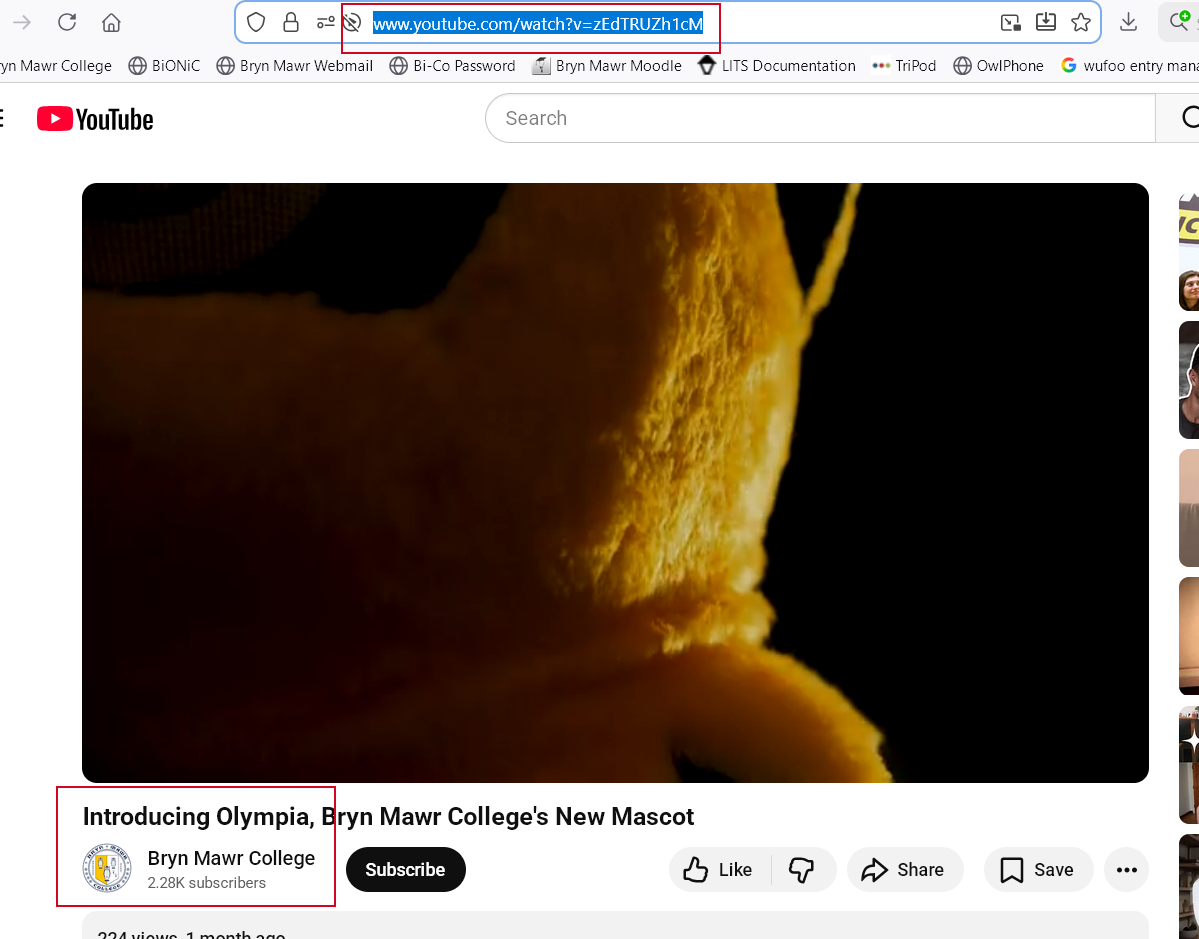
- visit your video on the web. for example, we are going to the Bryn Mawr College YouTube channel and selecting a video to view.
- once there, you can simply copy the URL from the browser address bar
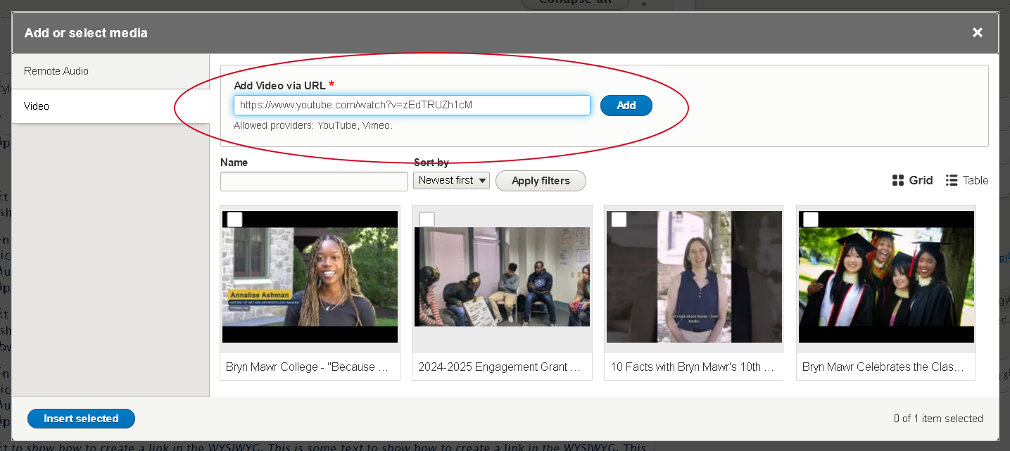
- then, simply paste that URL into the "Add Video via URL" field and click the blue "Add" button
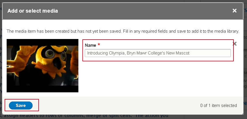
- this will take you to a different modal window that lets you edit the Name field of the Video. This field is how you will find the video later in the library.
- once you are satisfied you can click the "Save" button
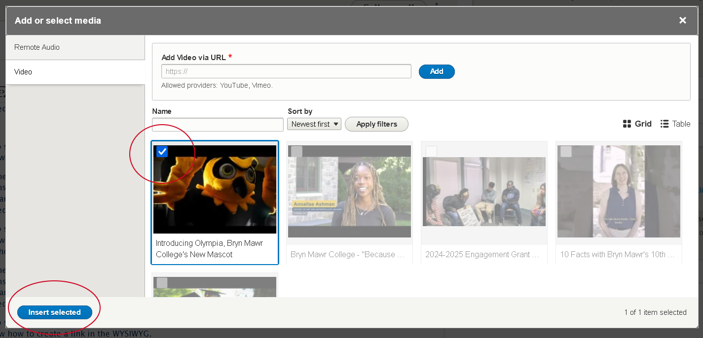
- this takes you back to the library modal, where you can see that the video has a check mark on it. This means it is already selected.
- If you are happy that is the video you wish to select, press the "Insert selected" button
- Find an Existing Video in the library
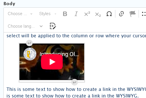
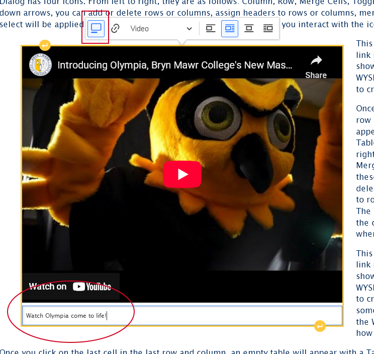
- Once you are back in the editor, you will see that the video seems small.
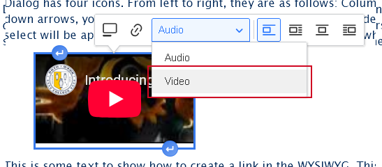
you can click once on the video to make the Video Dialog appear to adjust how it should appear.- select the "Video" view mode. This will ensure it displays properly on the page
- you can also choose to float the video to the right or the left, which will then have the text on the page wrap around it.
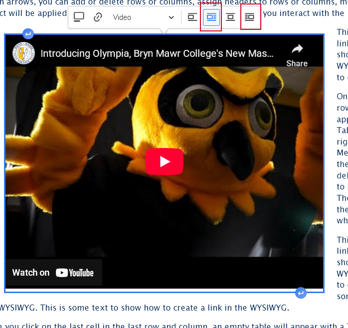
- you can also choose to add a caption to the video
- select the "Video" view mode. This will ensure it displays properly on the page
- Similarly to an Image, you can use the "Insert Paragraph" before and after buttons that you see if you hover on the video in order to add content before or after the video


Embed an Audio (Spotify or SoundCloud)
This feature is limited to only Spotify or SoundCloud audio tracks.
What if my audio track, podcast or playlist can't also be found in Spotify or SoundCloud? please see our Embed Other Content Items instructions.
To embed an audio in the WYSIWYG via the Insert Media button, you would place your cursor where you want the audio to appear and then click the Insert Media icon in the toolbar.
- Place cursor on a new line where you want your audio to appear
- Press the Insert Media button in the toolbar
- The Media Library modal window will open.

- First select the Vertical Tab on the left for the type of media you are inserting. In this case it will be the "Audio" tab

- You can now choose to Use an existing audio or Add a new one to the library
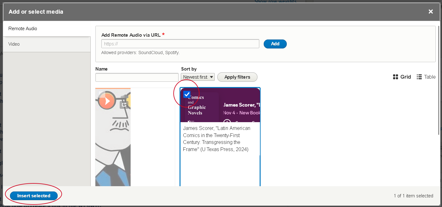
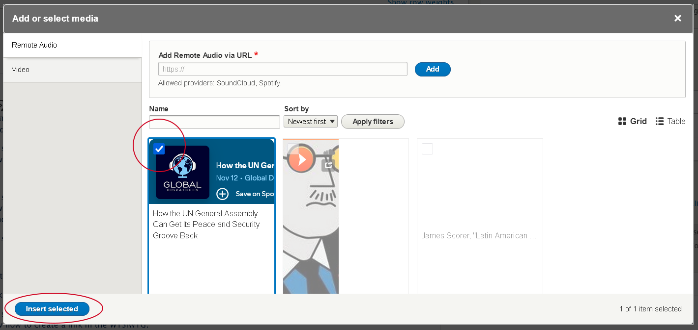
- Find an Existing Audio in the library
- Using the Name filter, type what you think it is called and press "Apply filters"
- You can also use the "Table" view by clicking the icon to the right of the filters, incase the Grid view isn't as helpful
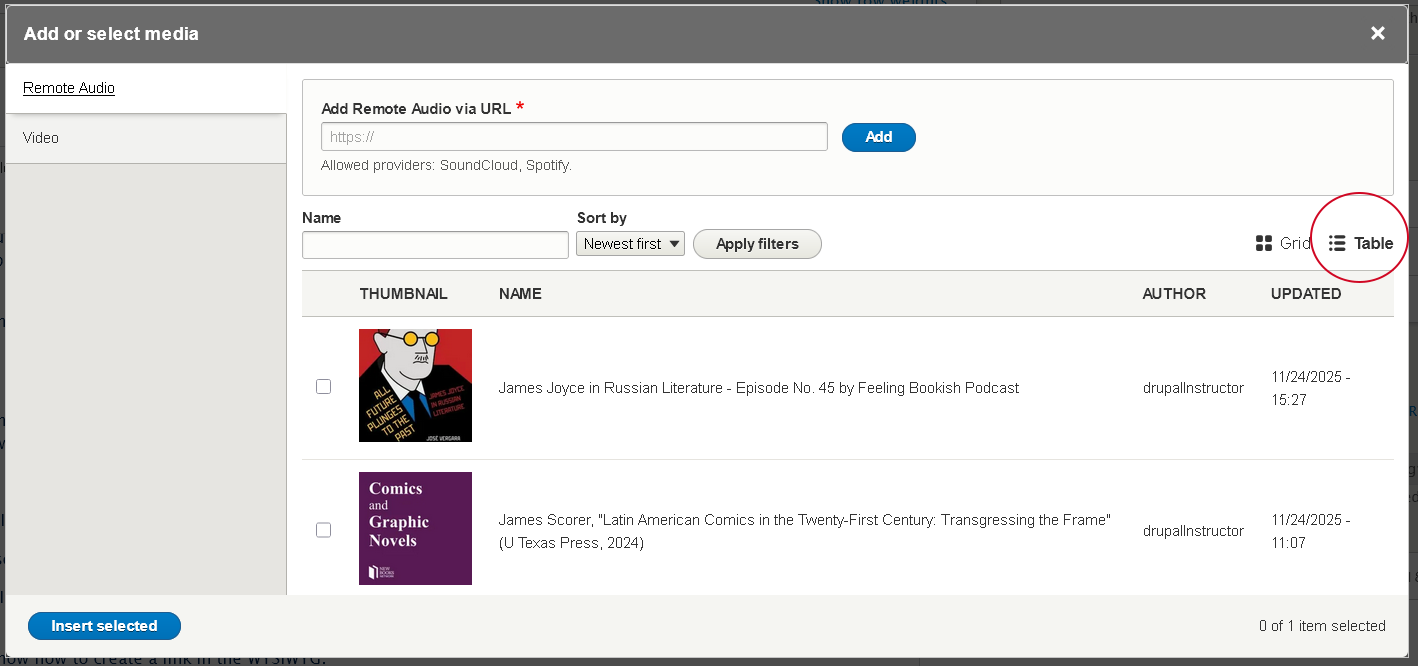
- depending on the view (Grid or Table), click on the audio or check the box next to the audio you wish to insert
- press the "Insert selected" button at the bottom of the modal window
- Using the Name filter, type what you think it is called and press "Apply filters"
- Add a New Audio to the library
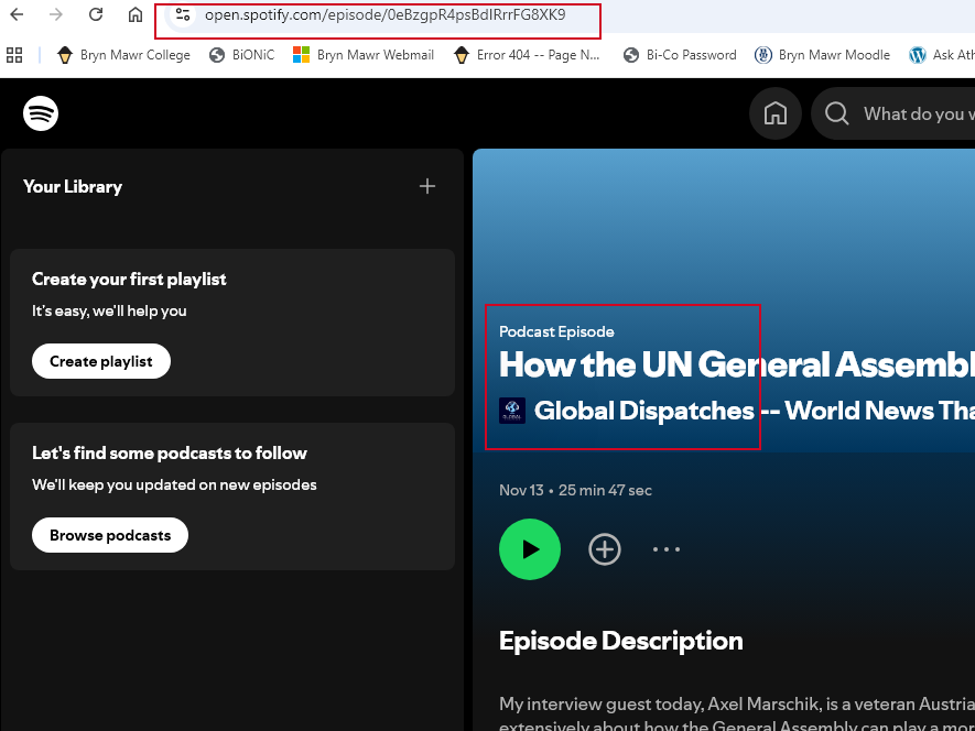
- visit your video on the web. for example, we are going to the Global Dispatches podcast on Spotify and selecting a track to use.
- once there, you can simply copy the URL from the browser address bar
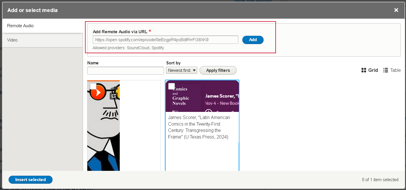
- then, simply paste that URL into the "Add Remote Audio via URL" field and click the blue "Add" button
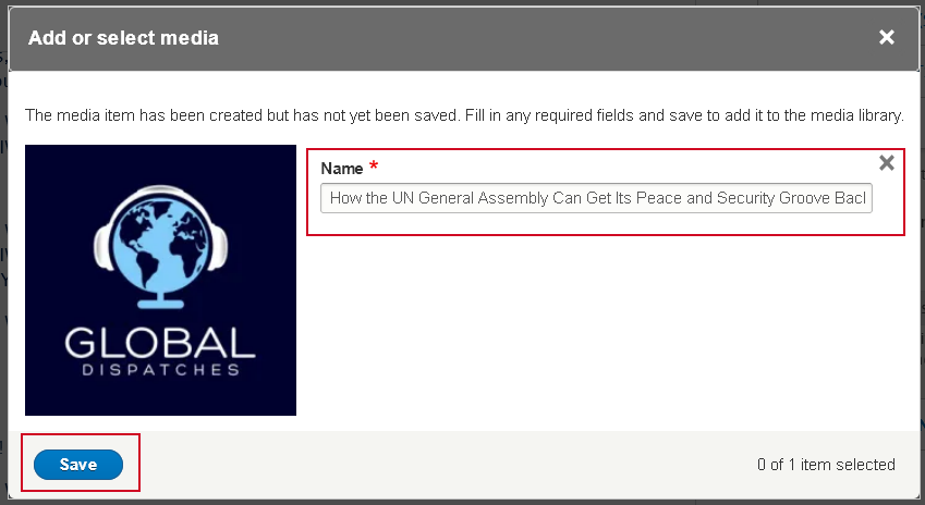
- this will take you to a different modal window that lets you edit the Name field of the Audio. This field is how you will find the audio later in the library.
- once you are satisfied you can click the "Save" button
- this takes you back to the library modal, where you can see that the audio has a check mark on it. This means it is already selected.
- If you are happy that is the audio you wish to select, press the "Insert selected" button
- Find an Existing Audio in the library
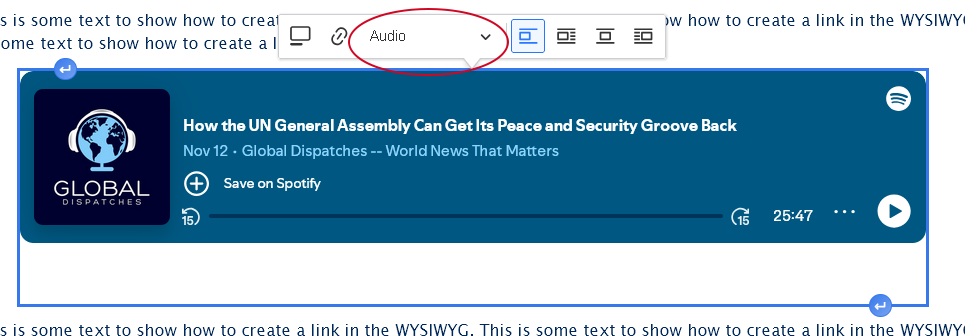
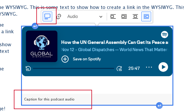
- Once you are back in the editor, you can click once on the audio to make the Audio Dialog appear.
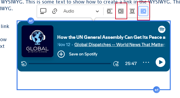
- Check to see that the "Audio" view mode is default selected. This will ensure it displays properly on the page
- You can also choose to float the audio to the right or the left, which will then have the text on the page wrap around it.
- You can also choose to add a caption to the audio
- Check to see that the "Audio" view mode is default selected. This will ensure it displays properly on the page
- Similarly to an Image, you can use the "Insert Paragraph" before and after buttons that you see if you hover on the audio in order to add content before or after the audio.


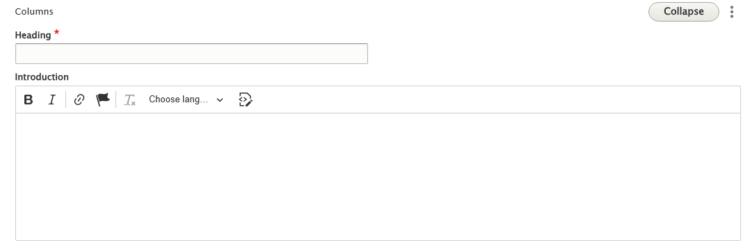
Columns
Columns is a Flexible Content Item that allows you to make a columned display of a list of items that have title, image, body text and URL that display three across as a block of content. The Columns Flexible Content Item starts with a heading and an introduction field to display before the list of items
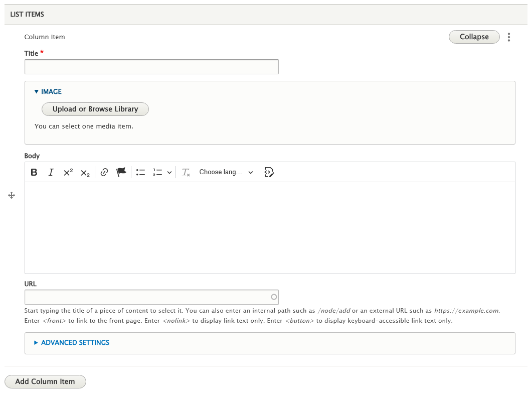
Each item has title, image, body text and URL fields where the only field that is required is the title. The URL field will make the title text into a link to that URL you put in.
This example shows all fields filled in with three items
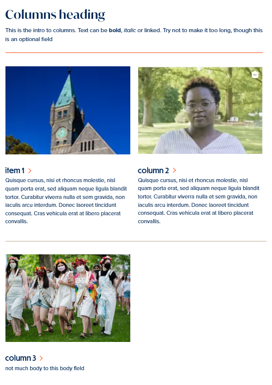
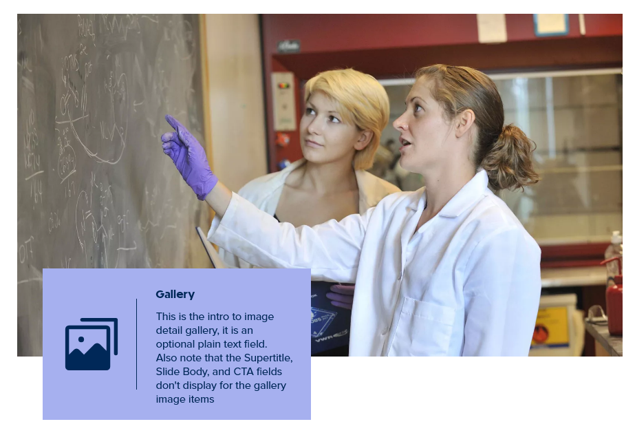
Image Gallery
This Flexible Content Item consists of a Main Image that is used as the cover photo to indicate there is a gallery, then when the visitor clicks on it, a slideshow opens up in a Lightbox so the person can view the gallery of images as slides.
As you can see, the Main Image and first slide title and image are required fields. It is recommended that the Main Image be one of the images from your slide deck.
NOTE: The Gallery optional field (Introduction) does appear if filled in.
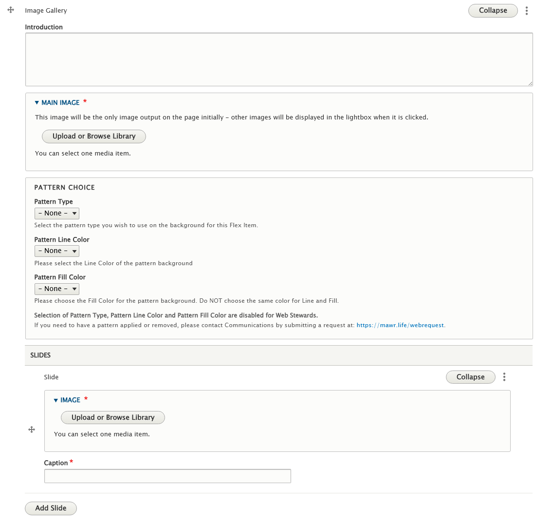
Once you add a second slide, you can drag to reorder the slides using the crosshair next to the word Slide

Please note that the Office of Communications and Marketing applies Patterns sparingly at their discretion.
Web Stewards will only be able to create Image Gallery Flex Items with the Default white background.
Here is how our example looks on the page:
This is how it appears in a Lightbox when you click on the Gallery element
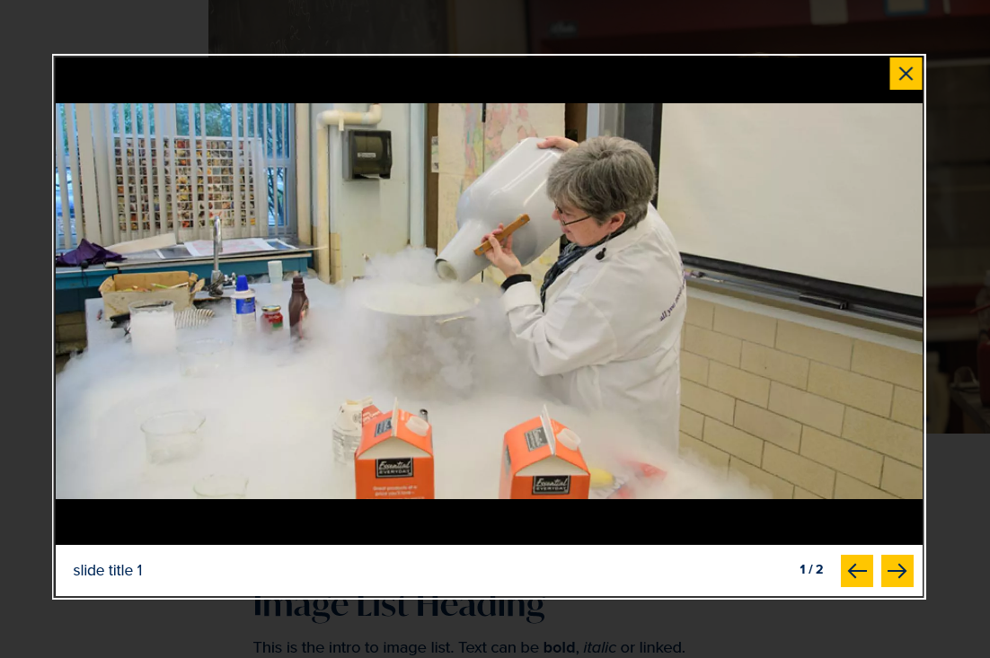
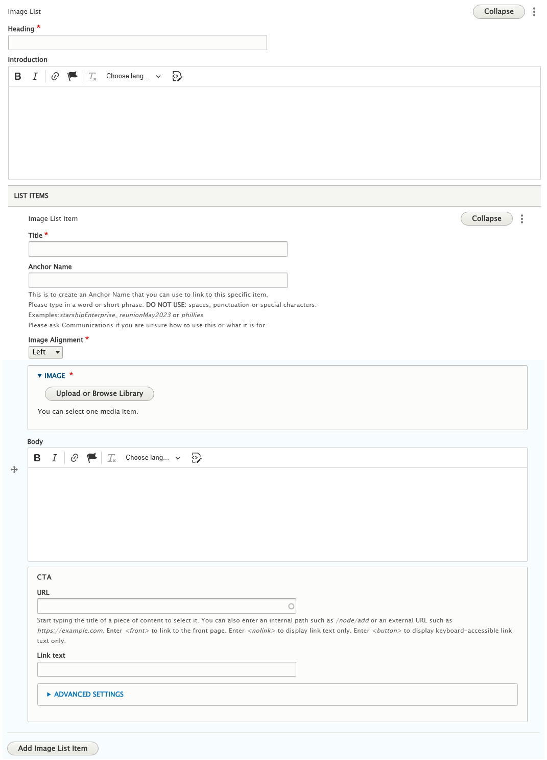
Image List
This Flexible Content Item has the ability to pair an image with text and to alternate which side the image aligns on, this makes it a great choice for creating a list of Image/Text pairings to present some important things to highlight.
Please note that some fields are optional, which gives you flexibility in how your content is displayed.
Of Note: There is an optional field called Anchor Name that will add an anchor name (ex: myAnchor ) to an Image List item. This is to create an Anchor Name that you can use to link to a specific Image List item.
Please type in a word or short phrase. DO NOT USE: spaces, punctuation or special characters.
Examples:starshipEnterprise, reunionMay2023 or phillies
Please ask Communications if you are unsure how to use this or what it is for.
By placing an anchor name on an Image List item, you can then link to it on a different page.
This works like most anchor links. You would need to notate the Anchor Name you assigned and the URL of the page that the Image List is on.
So, for example, my Image List is on my Style Guide page: https://www.brynmawr.edu/inside/offices-services/library-information-technology-services/projects-partnerships/web-services/drupal-guides/basic-page-style-guide (which is node/53216) and my Anchor Name is sampleAnchor
Now, when I want to make a link to that specific Image List item from a different page.
For instance if I was editing the main Web Services page, I could add a link in the WYSIWYG area of the main Web Services page to my Style Guide page with the anchor like so: /node/53216#sampleAnchor .
You can read more about anchor links in general here: https://askathena.brynmawr.edu/help/drupal-basic-flex-basic-wysiwyg#linking-to-a-specific-part-of-a-page-
Here is a screenshot of the Image List content entry form.
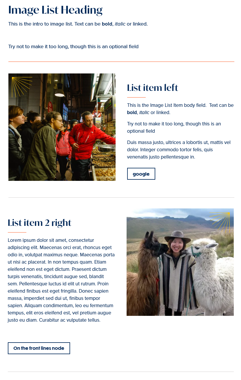
Below is the screenshot of the Image List on a page. In this example, on the first Image List item we filled in all the fields, the second Image List item we only filled in the required fields
More Flex Articles
Please see the following Articles for how to use the following Flexible Content Items.
- FLEX: Basic - WYSIWYG (basic, links, tables, blockquotes and images & videos from library)
- FLEX: Basic 2 - Accordion, Callout, Carousel, Contact, Embed, Social Media: Callout, Special List: Large, Special List: Small
- FLEX: Intermediate A - WYSIWYG (Video), Columns, Feature: Grid, Image Gallery, Image List
- FLEX: Intermediate B - People: List, Social Media: Connect, Feature: Large, Feature: Medium, Feature: Quote, Image Detail: Large
- FLEX: Advanced - Event 3-up, News 3-up, News & Contact, Story 1-up, Story 3-up, Announcement 4-up
- FLEX: Special - Slide: Homepage Hero, Homepage Feature: Large, Homepage Feature: Medium, Homepage Feature: Story, Course Code, Description Code, Donor List
Please note that Flex Advanced and Flex Special items require training and possibly special permission levels.
As with anything on the site, if you are unsure what the item is, how it looks or how to best utilize it, please see our sample pages Basic Page with all content and News article with all content or reach out to Communications for guidance at communications@brynmawr.edu.
Please note, there are corresponding training videos available that cover some of the items in these articles. Some items may require increased permission levels and special training. Please reach out to Communications for guidance at communications@brynmawr.edu.
If after reading this article or watching the training videos you still have questions, we can help! Sign-up for any of our Drupal Drop-ins throughout the year. Schedule a Drupal training session for you or your whole department with our Drupal Trainer. If you have any additional questions or problems, don't hesitate to reach out to the Help Desk! Phone: 610-526-7440 | Library and Help Desk hoursStill need Drupal help? Have more Drupal questions?
Questions?
Email: help@brynmawr.edu | Service catalog
Location: Canaday Library 1st floor
