Flexible Content Items
In our first article about Flexible Content Items, we discussed a general overview of what Flexible Content Items are, how to use them and where to find them.
In this article we discuss how to create the following Flexible Content Items:
- Accordion
- Callout
- Carousel
- Contact
- Embed
- Social Media: Callout
- Special List: Large
- Special List: Small
Accordion
Learn about the accordion
What is an Accordion and why do I care?
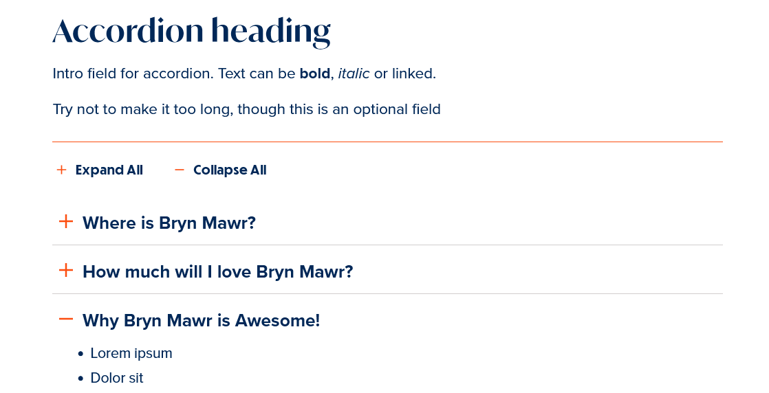
An accordion on a web page is a tool used to collapse content to minimize scrolling for the end user. The headings, or accordion titles, act as a way for viewers to see at-a-glance some of the content on the page.
There are 3 general principles that should be considered when using accordions: reducing cognitive load, increasing readability, and clarity.
On the downside, hiding content behind the accordion diminishes people’s awareness of it. Therefore, headings and titles must be descriptive and enticing enough to motivate people to click on them. When content is hidden, people might ignore information. Luckily, our accordion has an expand-all feature for people to click once and have all the accordion items expand simultaneously.
How can Accordion Help My Page?
Accordions are most appropriate when users will only need a few specific pieces of content within a page or if you have only a small space to display a lot of content. Accordions can be used on a page with more content, but since accordions are a more at-a-glance type of component, I would recommend using them closer to the beginning of the page. Of course one must also keep the flow of content in mind and make sure the accordion is in a place within the rest of the information where it makes the most sense.
Having an accordion for Questions/Answers or FAQ is a great use of accordions because you can easily see which question is of interest and only have to expand that accordion item if you desire.
How to create an accordion
This Flexible Content Item is a typical accordion element, where you have a Title and an Item for each accordion item in the accordion list. You can add as many Accordion Items as you’d like, using the “Add Accordion Item” pill button. The Accordion has a Heading and Introduction that will appear before the accordion list.
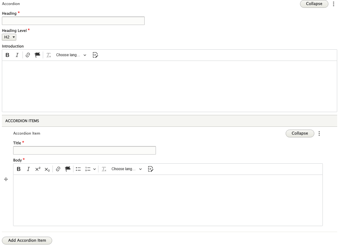
It displays like this on the page:
Callout
What is a Callout and why do I care?
Callouts, or callout boxes, allow you to create stylized boxes for featured content. These callouts give users a visual cue that the information is important and helps offset this featured content from the rest of the page.
A Callout should be short, easy to scan, informative and clear.
How can a Callout Help My Page?
You can highlight some of the content on your page which will increase the usability of the page and make it easier for visitors to find the information they are looking for.
A callout box is an effective way to do this.
Our callout is a box that allows room for a heading, some additional messaging, an image and up to 3 CTA buttons. You can also choose from two background color options (grey or yellow).
None of the fields are required so the Callout is a very versatile way to display just what you need.
You can use it to just display some call-to-action buttons on your page in between content blocks.
Or you can use it for highlighting some informative text.
Or you can use it to spotlight something in an at-a-glance sort of way. Maybe your page is discussing exams, so the Callout could be used to list the Exam Schedule as a bulleted list, for instance.
Since the Callout is a Flex Content Item, it can be rearranged with the other Flex Content Items to enhance the flow of the information on your page.
How to create a Callout
This is a Flexible Content Item that calls attention to something. It allows you to have an image, title, body text and up to three links. This is a versatile element because you have the ability to just have a heading, or just have links or just have some text, or include an image. This is what it looks like displayed on the page with all the options filled in:
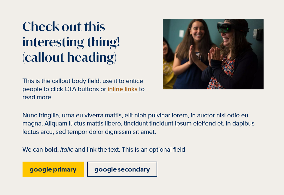
When you choose to Add Callout you will see options to fill in. A heading and a heading level. This allows you to be mindful of accessibility needs by properly setting the correct heading level. It is defaulted to H2, which is usually fine for most situations. If you don’t fill in a heading, no text will appear.
It allows you to select the color background for the box, with choices of either feather or navy. It is defaulted to feather.
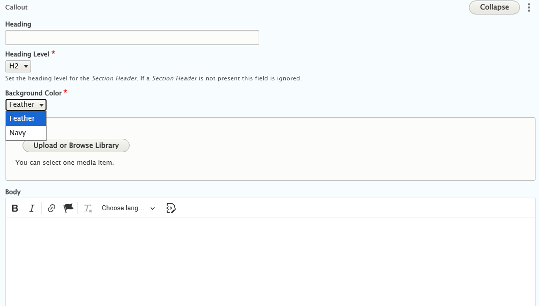
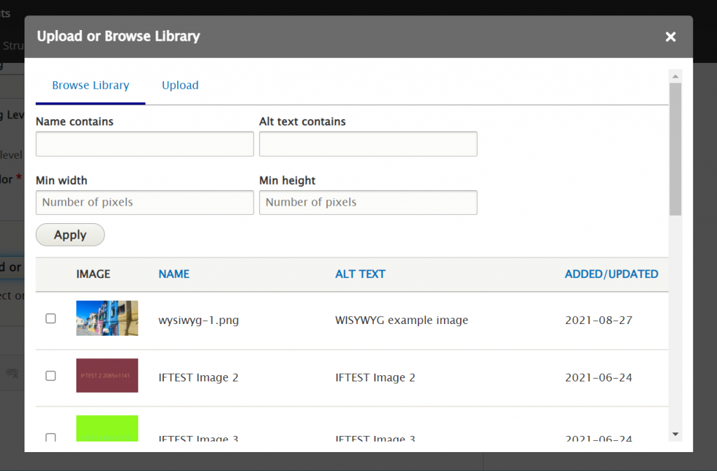
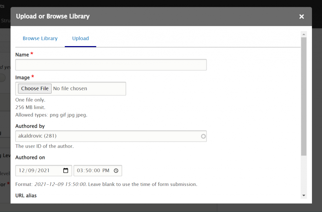
You can optionally add an image, body text and up to three links.
You can either upload or select an image that is already in our site’s Media Library. We will go over Uploading an image in detail on our Media article.
The three links can be set to open in a target window, and is default to “none” (no target selected). These links are optional.
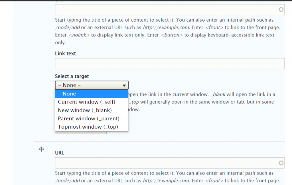
These links can also be set to have either a primary or secondary style, or just be a plain link
Carousel
What is a Carousel and why do I care?
Carousels, also known as sliders, refer to a slideshow of photo content on a website. Carousels display various content of the same type or topic and are navigated manually with arrows.
They work great to keep visitors interested in page content and encourage them to explore the topic or learn more about it by following the CTA on the slide.
Effectively, wherever you want to break out a section of content that’s tied together within a specific, and relevant context, web carousels can help.
How can a Carousel Help My Page?
Carousels can help you highlight a certain type of content to increase its visibility and engagement.
Our carousels are image centric and are a good way to provide a visually engaging user experience especially on a text heavy page.
Carousels can be a suitable alternative to the “wall of text,” helping make your content more engaging.
To build engaging carousels, use them sparingly and try to use no more than 5 slides in a carousel.
The more carousels (or slides) you have, the less likely users will watch the entire carousel content. Basically, the first three slides receive the most views, according to some usability studies.
Create a powerful Call To Action - The CTA, or Call To Action, is the key component of any website that allows users to clearly understand what to do after they learn the page’s content. So, any CTA that you create should be written with clear text for a specific goal. Examples of good CTAs are “Learn More About the Program,” or “Request a Consultation.” Bad examples are “Read More” or “Click Here”. This is important for good accessibility, whether the CTA is on a slide or otherwise displayed on the page.
How to create a Carousel
To maximize the efficiency of your carousel, make sure the text on each slide is short and simple, making it easy to read and with a clear message.
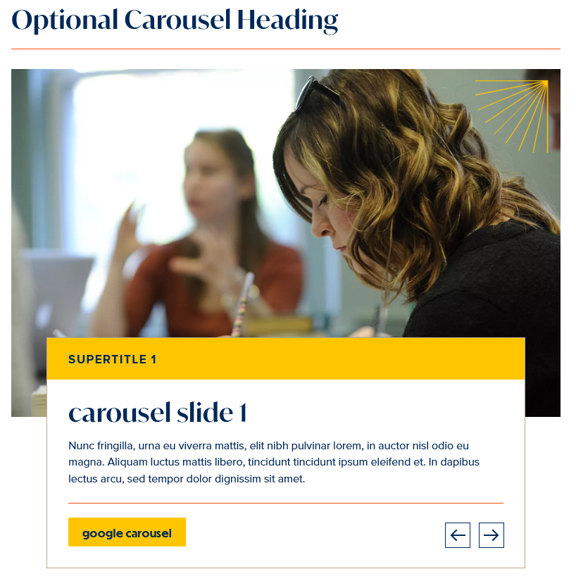
Our Carousel has an optional heading that would display above the slideshow.
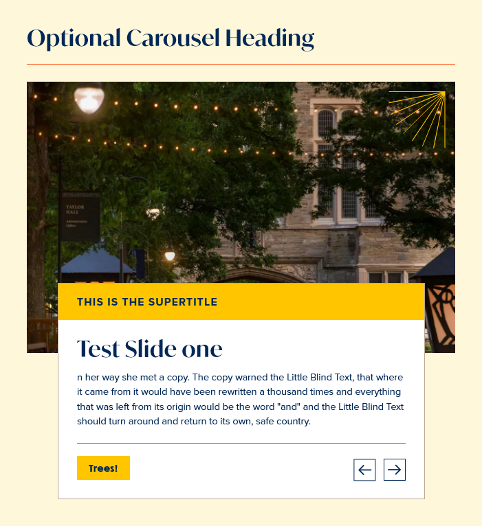
Our slides consist of a title, supertitle (which displays over the title), image, body and CTA. Only the title, image and CTA are required.
A carousel is a Flexible Content Item that can be added to any Basic Page, News Article or Event, if logged in.
When you click-select the Carousel from the Flexible Content list, you will get fields to fill in for the behavior of the Carousel and fields for each slide, with a button to add another slide item
The behavior of the Carousel is just telling it which way to align the overlay text box, on the left or right side of the image. This alignment is for ALL the slides in the Carousel. This means that you will have to curate your images so they all look good with the text box over the same side throughout your carousel.
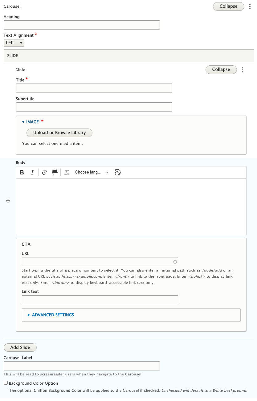
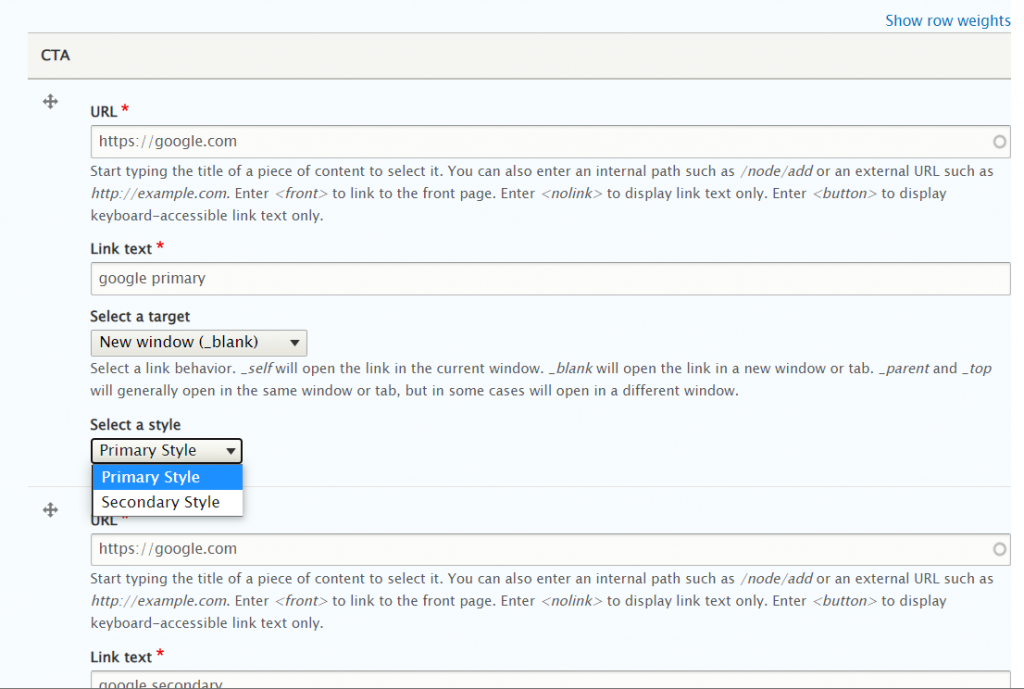
The fields for the Slide are Title, Supertitle (which appears above the title), Image, Body and a CTA (or Call to Action) which has a URL field and a Text field.
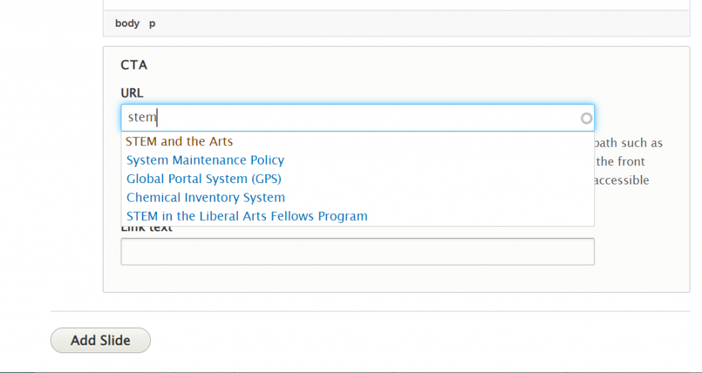
The CTA can have an outside URL like https://google.com or you can use the type-ahead box to look for the title of a node to link to. (Note: external or outside URLs must include http:// or https://)
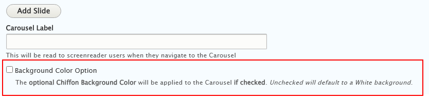
Optional Background Color
If you check the box for the Background Color Option, the Carousel will have a Chiffon background color, the Default (not checked) is White
Once you add all your slides and set the Carousel settings as you like, you can save the page and see how it looks.
Here is a Carousel with the Default white background
Here is a Carousel with the Optional Chiffon Background
Contact
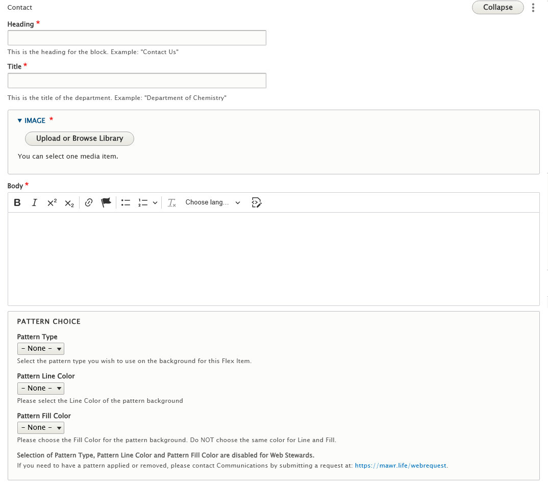
This is a great piece of Flexible Content that will allow you to put contact info on your page. It consists of Heading, Title, Image, and a body field, which is a limited WYSIWYG where you can write the contact info exactly the way you want.
Please note that the Office of Communications and Marketing applies Patterns sparingly at their discretion.
Web Stewards will only be able to create Contact Flex Items with the Default white background.
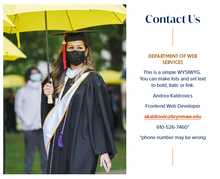
Here is how our example looks on the page:
Embed
This Flexible Content Item is used to embed a form or something advanced that the WYSIWYG is programmed to strip out. This talks about embebding code for forms. For working with videos, please see https://askathena.brynmawr.edu/help/drupal-intermediate-videos-in-drupal#adding-video-via-embed-flexible-content
If you have been granted Embed permissions, you may use these instructions to embed forms and other content that provide iframe or javascript embed code.
If you don’t have this permission but would like to request it, please reach out to help@brynmawr.edu or communications@brymnmawr.edu for assistance.
Only embed content from known, trusted sites. Ask Web Services if you aren’t sure.
Please use caution and get any code you don't fully understand vetted by Web Services before publishing on the website.
The Embed Flexible Content Item should only be used for specific code-related embedding needs.
It is an extra level of permission. If you don’t have that level of permission, you will see something like this:

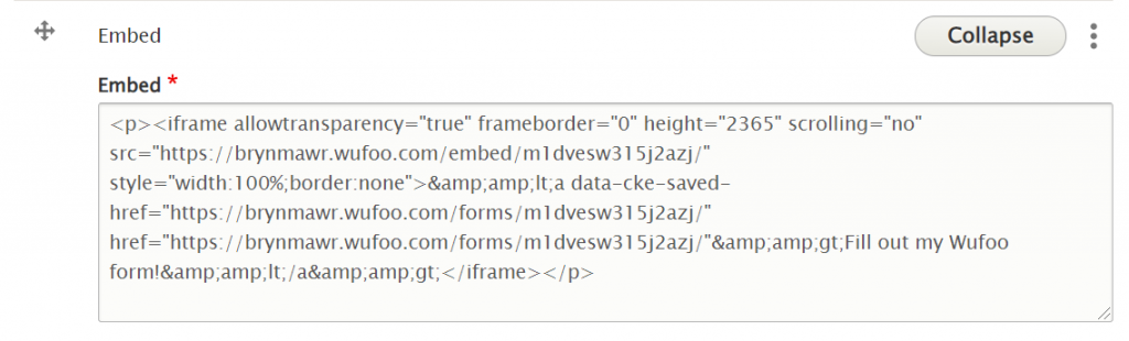
If you do have permission to use that Flexible Content Item, you would see a non-WYSIWYG text box appear. In this example, we will have pasted in the WuFoo embed code so a form will appear on the page.
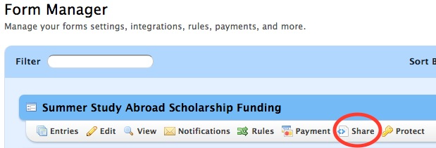
First step is to copy the embed code from the source. For example, in Wufoo, hover over your form and click “Share” to get the form code.
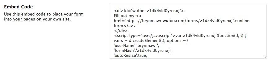
Next, click the Edit tab to edit your page and scroll to the bottomof the edit screen. Under Flexible Content, you can select "Add Embed" then paste the code into the non-WYSIWYG text box, like so
Save your page and see if the form or other content is displayed as expected.
Social Media: Callout
This Flexible Content Item allows you to add URL links to your department’s various social media accounts so folks can follow you online.
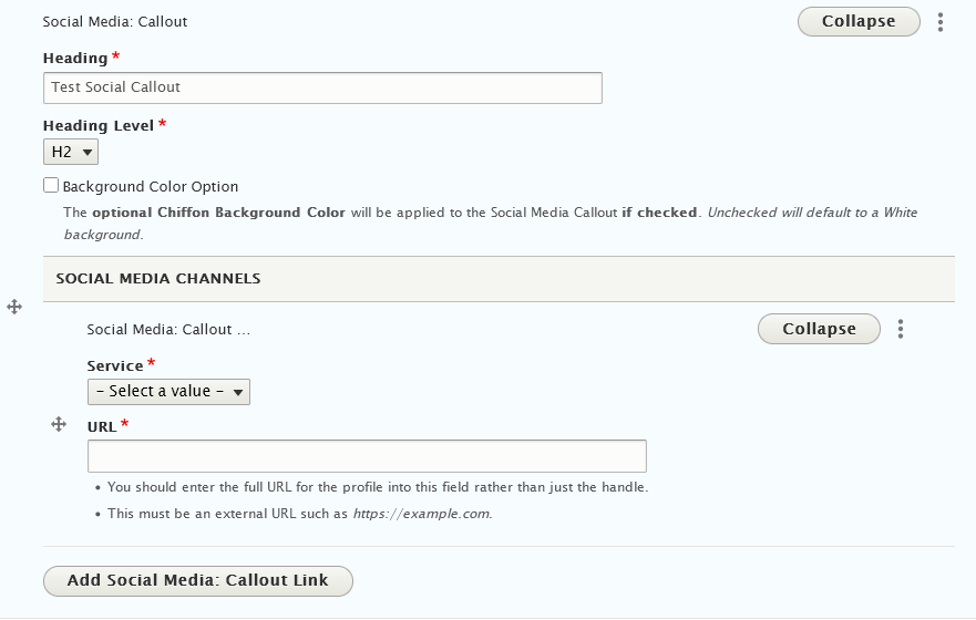
You can add URLs from Facebook, Instagram, Twitter, LinkedIn and YouTube
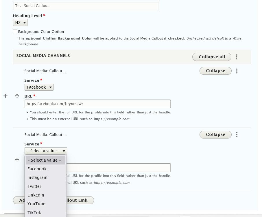
If you check the box for the Background Color Option, the Social Media Callout will have a Chiffon background color, the Default (not checked) is White
This is what it looks like on the page with the Default background:

Here is what it looks like with the Optional Chiffon Background:

Special Lists
What are Special Lists and why do I care?
In our collection of Flex Content Items, you will see both a Special List Small and a Special List Large. These are both ways to present a list of items in an elevated way. These aren’t your Grandma’s bulleted lists! These lists are in a larger font and displayed in a way to draw your eye to them and know they are something worth exploring.
The Special List Small is just a presentation of list items that may or may not be links, whereas the Special List Large also has a space to add a description to the linked or unlinked list title.
How can either a Special List Small or a Special List Large Help My Page?
As with most of the Flex Content Items available, Special List Small and Special List Large are ways to elevate your content and to also add visual interest to a page. Using either of these will help showcase lists of topics without the need for accompanying images.
The best way to use these is for shorter lists, especially when using the Special List Large which has space for supporting text. If you had a large amount of supporting text per list item, we would encourage you to use an Accordion instead.
As an added bonus, we also have a Quick Links Special List Small that can be added at the top of any Basic Page. Using this specific one limits the display to the top of the page, whereas if you added it as a Flex Content Item, you could move the component to a different spot in the flow of the page. Using the Quick Links is best when you have a page where you want to have these helpful in-page links present at the top so visitors can get to the next step or next page presented under that particular page’s topic
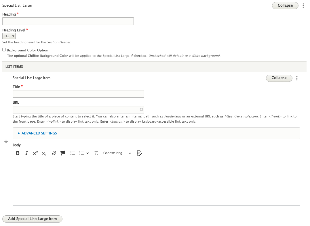
Special List: Large
How to create a Special List Large
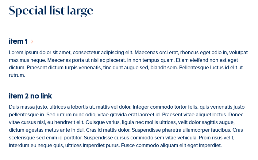
This Flexible Content Item allows you to have a Special List with a title that can be linked or not, along with some additional text that you would add to the body field.
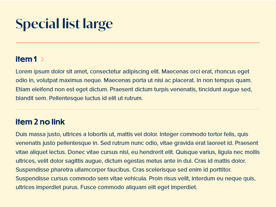
If you check the box for the Background Color Option, the Special List will have a Chiffon background color, the Default (not checked) is White
This is what it looks like on the page with the Default white background
Here is what it looks like with the Optional Chiffon Background:
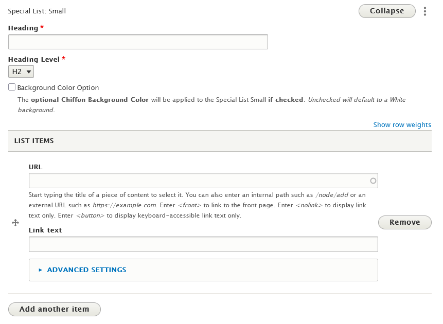
Special List: Small
How to create a Special List
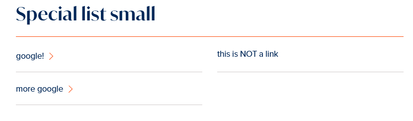
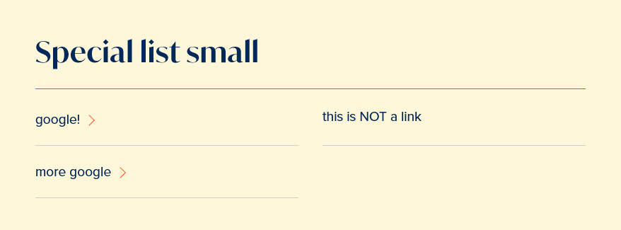
This Flexible Content Item is a small list of titles only.
Special List: Small is also an additional part of the Basic Page in a special spot at the top called Audience Quick Links.
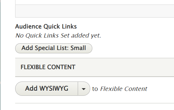
Adding links to a Special List: Small is the same in either spot, but the Audience Quick Links can’t be moved on the page like the Special List: Small can within the Flexible Content area.
The Audience Quick Links is for only one Special List: Small in that designated display area of the page. You can see it at the top of our Basic Page All Content page.
The Audience Quick Links will not have a background option applied, it will always be default white.
You can add as many List items as you’d like.
For the Flexible Content Special List: Small, you can add multiple of this Flex Item to a page.
This Flexible Content Item allows you to have a Special List with a title that can be linked or not, along with some additional text that you would add to the body field.
This is how it looks on the page with the Default white background
Here is what it looks like with the Optional Chiffon Background:
More Flex Articles
Please see the following Articles for how to use the following Flexible Content Items.
- FLEX: Basic - WYSIWYG (basic, links, tables, blockquotes and images & videos from library)
- FLEX: Basic 2 - Accordion, Callout, Carousel, Contact, Embed, Social Media: Callout, Special List: Large, Special List: Small
- FLEX: Intermediate A - WYSIWYG (Video), Columns, Feature: Grid, Image Gallery, Image List
- FLEX: Intermediate B - People: List, Social Media: Connect, Feature: Large, Feature: Medium, Feature: Quote, Image Detail: Large
- FLEX: Advanced - Event 3-up, News 3-up, News & Contact, Story 1-up, Story 3-up, Announcement 4-up
- FLEX: Special - Slide: Homepage Hero, Homepage Feature: Large, Homepage Feature: Medium, Homepage Feature: Story, Course Code, Description Code, Donor List
Please note that Flex Advanced and Flex Special items require training and possibly special permission levels.
As with anything on the site, if you are unsure what the item is, how it looks or how to best utilize it, please see our sample pages Basic Page with all content and News article with all content or reach out to Communications for guidance at communications@brynmawr.edu.
Please note, there are corresponding training videos available that cover some of the items in these articles. Some items may require increased permission levels and special training. Please reach out to Communications for guidance at communications@brynmawr.edu.
If after reading this article or watching the training videos you still have questions, we can help! Sign-up for any of our Drupal Drop-ins throughout the year. Schedule a Drupal training session for you or your whole department with our Drupal Trainer. If you have any additional questions or problems, don't hesitate to reach out to the Help Desk! Phone: 610-526-7440 | Library and Help Desk hoursStill need Drupal help? Have more Drupal questions?
Questions?
Email: help@brynmawr.edu | Service catalog
Location: Canaday Library 1st floor
